 5)
An Oil-Painted Version 5)
An Oil-Painted Version
For
an undergraduate course in art which I took at Brown
University, I thought a wonderfully offbeat final term
project would be to apply what Land had discovered to the
illustrative arts. Since no one had told me "this can't be
done," I decided to attempt to render that familiar Retinex
still-life in oils. The big trick is that I would limit
myself to the same colors of the Land experiment: black and
white for the medium filtered portions (taken through
green), adding only red to these for the long filter
portions (taken through red). Just three tubes of paint.
What would THAT do?? I realized from experiments that there
ought be a wide black border, to separate the limited color
image from the rest of the real world's much greater color
range. So the painting would be mounted within an opening
cut in a large piece of black poster cardboard.
The painting itself was
executed in pretty much the usual way, on a sheet of what's
called "canvas board:" a cotton canvas glued down to a thick
layer of cardboard. That takes longer to dry, as the air
will only circulate from the front, but in this case it
saved stretching and mounting the canvas before painting,
something I'd done before and didn't want to be bothered
with on a deadline. The paints were the usual Grumbacher
tubes that my father and I frequently used when we wanted to
fool with oil-painting. We had a bottle of linseed oil (that
odor still brings back many happy memories!), a tin of
turpentine, and some assorted brushes. Nothing fancy.
I measured one of the
photos in the magazine article, laid out the original shapes
in pencil on the canvas, and began to paint. I referred
constantly to those two black and white images you saw
above. Those guided me as to what proportion of white and
red to add to the black, or vice-versa, to maintain the same
proportions of dark and light as the original color
separations contained. I deliberately toned down the
background a little, so that the brighter portions, which
weren't all that bright, would look lighter by contrast, and
show off the color tones I hoped for. It might not even work
-- yikes! I included a small light with the final canvas and
black poster board, so that a beam of could be cast on the
canvas, the rest of the room's lights extinguished. I wrote
a short accompanying paper which both gave some of the
fundamentals of the then available understanding of Retinex
color vision, and suggested other ways to view the painting.
So that was the project: something old, something new,
something borrowed, and black & white and red all
over...! ;^) Um. Got carried away there...
Alas, I underestimated
the amount of work involved (the story of my life, you have
no idea...), and discovered to my chagrin that I would not
make the final deadline for the paper. I told lanky, laconic
Professor Roberts a few days before, and he granted me a
short extension over the weekend. Later he admitted that was
very pleased with the paper and the painting, and had some
surprisingly kind words to say. But he wasn't so kind when
he marked it: "A+ for the paper (crossed out), final value
due to lateness, C+"... grrr... I saw the point, but it was
an ouch, and I still bet this was one of the most unusual
term papers / projects handed to him for any undergraduate
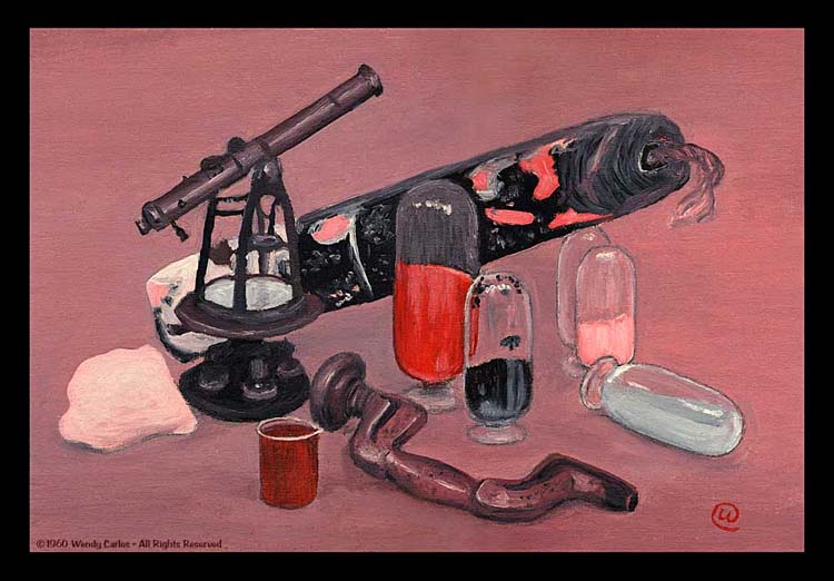
art class!
Before I'd done my
painting it wasn't at all obvious if Land's initial
discoveries, which were done "additively,"
combining images by projecting (or merging the light with
half-mirrors), would work in an oil painting, a real risk
(the something new). Painting is a world of
"subtractive"
colors, pigments blended in such a way that only what all
colors in a mix reflect well gets to be seen as a light
tone. If you add green and red lights, you see a vivid
yellow. If you mix green and red paints, well, you know, you
get a sort of muddy brown. If you mix quite a bit of black
paint with any other color, the result is pretty murky. But
shine a nearly extinguished or "blackened" light over the
beam from a white light, and, well, the white remains white.
Different worlds (the
difference between logical "AND" and "OR," in
fact...). So I had to
be very selective as I tried my stunt, to be sure within the
very small range of actual colors I'd be using, that the
reflected shades matched closely to the proportions that
colored lights would display. I was very tickled when I had
finished it, and while still wet gave it a look-see with a
small lamp in the darkened room -- eureka, it worked!
You can view the
painting on your computer screen.
(Here's
an even larger version,
for large monitors or to print
out.)
But it won't work out nearly so well as viewing a print of
it in a darkened room with a small spot of light on it.
Probably need to attach a black border of several inches all
around, too, after you print it out for yourself to try. It
also works better if you are at a little distance, so all
the fovea of the eye can see it at a glance, and the Retinex
process better kicks in. As I suggested, a bit of squinting
also helps. Even better is to use the neat viewing light
described next. But that came around 25 years later, as I
didn't even suspect such an idea existed when I painted the
original. I'm lucky that my parents are "packrats" like me,
too. They had saved the painting in their basement, where I
found it years later, around the time when I had made the
special light box in the late 80's. The black poster board
frame had deteriorated into a shambles. But the canvas board
and oils were as fresh as new after a bit of dusting and
cleaning. I masked the center main parts of the painting
with some tape and cardboard, then sprayed matte black paint
over the outer edge, which had been left blank originally,
as it was behind the poster board. The spray paint trick
worked well, and that's how you see it above.
|
 (Top
of the Page)
(Top
of the Page)
|
6)
A Fascinating Viewer to Make
I
was delighted when my December 1977 subscription issue of
Scientific American arrived in the downstairs mail drop box
which was located in the brownstone studio's outer door. For
there on the cover was another article on color theory, and,
yes, it was the "sequel" by Edwin Land of the pioneering
report over 18 years earlier. Yeay! By now he and his team
had moved onto more complex interactions, often involving
all three primary colors, although the basics behind the way
the earlier two-color process was by no means forgotten. The
team had constructed special new equipment so that they
could control the balance of red, green, and blue light
falling onto two large panels, then measure any spot on
either surface with a precision photometer equipped with a
telescopic field of view and aiming viewfinder. It brought
the element of the quantifiable to the qualitative results
described earlier.
The panels were usually
covered with a more or less random number of rectangular
pieces of colored paper of every imaginable hue. When 50 or
a hundred or more of these various sized color "swatches"
were pasted up on the boards, usually making each paste-up a
pretty good duplicate of the other, they resembled somewhat
the paintings of Mondrian. So the team got to calling these
colorful panels: "Mondrians." By turning the dials of variac
transformers the proportion of the three colors of lights
that fell on either panel could be controlled. Then one
could compare the visual impression when, say, one bluish
tone on one side was made to measure exactly the same as a
greener one on the other side. You'd look at the two panels,
and might smile to realize that the small swatch you saw to
be "blue" on one side was in fact an exact match to the
other one you saw as being "green." Other controlled
experiments investigated the influence of surrounding
blotches of color on a central one. Basic rules emerged, and
many surprises, too.
One could "test" the
idea that we need only two active receptors for color
vision, by using the rods of the eye along with the long
wave (red) cones. (No green or blue cones.) The team used an
exceedingly dim green light and also a very extreme red one
in an experiment devised by Land's collaborators, John
McCann and Jeanne Benton. I thought the descriptions sounded
particularly wild (could this be true?!), and had to "see"
literally what this experiment was all about, constructing
the box you see above. You can duplicate it yourself for
just a few dollars and a few hours some evening. You'll need
a small, flat cardboard box. The box a small parametric
equalizer came in seemed to be a reasonable size, about six
inches square on the front, and about two inches thick. I
cut the two aperture on the top or front, using a razor
blade and ruler, about 2 1/2 inches square each opening.
Behind the openings I mounted two small flashlight bulbs in
sockets I bought at Radio Shack. Double stick foam tape
pieces made quick work of the mounting of them inside what
was the bottom of the original box.
I also found a small
battery holder for two "D" cells (long life with bulbs), and
two 25 ohm rheostats (more foam tape), to adjust the
brightness of each of the two bulbs. I scrounged a couple of
knobs in my studio parts drawer, and some extra bits of
cardboard and tape to rig an interior wall. That keeps the
light on each side isolated from the opposite side. You can
see most of this by studying the images above. The most
expensive elements were the color filters. Here I wanted to
be completely honest, so I bought some decent Kodak Wratten
gel filters at the neighborhood photo store (you may have to
order them). In the late 80's these were still only a few
dollars each. I couldn't find a red gel that would pass
light only at a suitably long wavelength that the red cones
only could detect (the green cones overlap closely). You
need slightly more than 650 nanometers, which is a very deep
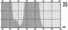
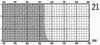
red. In the end I taped a sandwich of a deep purple Wratten
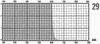
filter (#35) with an orange one (#21), as this seemed, from
studying the Wratten Filter charts, to provide light only
above 650 nm, as desired. You'll obtain a very steep cut off
curve from this sandwich. Yes, you can substitute any deep
red and green filters for the viewer, but these definitely
work the best:
RED
= one from: 34, 34A, 35 or 36, plus one from: 15, 16, and on
through 26.
GREEN
= 58, 61, 74, 93 or 99.
(P.S.
Note: while looking through Kodak's book on Wratten
filters yesterday, I noticed that a #92 will also work
quite well for the red, but that #70 is much better, and
would duplicate the effect of the "sandwich" that I used.
Now I remember -- Kodak reported to my local photo store
that the #70 was temporarily out of stock back then, but
you may have better luck now.)
|
|
|
|
|
Usual
deep red filter
|
But
add this purple
|
to
this orange...
|
then
use this green
|
|
CLICK
HERE
for more about the best filters for the
viewer
|
For the other aperture
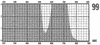
I used a deep green near monochromat Wratten gel (#99,
although a #93 is also good), the one filter, with it's peak
transmission centered near 545 nanometers. There's little
gained with red and green LED's, as their color output is
very broad, nothing like our color filters (you'll still
need the filters).The batteries in place, I flipped the
small switch (forgot to mention that, but it's in the pix --
you wire it in series with the batteries), and both bulbs
lighted. Yes! Then I cranked the two rheostats down (one in
series with each bulb), and they faded out, clean and
smoothly. Fine, ready to go! What we want to do is to
extinguish all the lights in a room that you can close the
shades to, perhaps the door also, and use only the narrow
colors the box provides to examine daily objects, some color
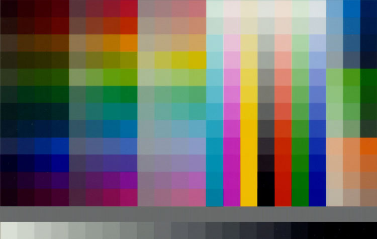
photos and other printed material. One good reference will
be a color chart. Do you have one of those? If not, check
out this one here:
Click on this small image
to open a new window with a decent quality color chart jpeg
in it, save that file, and print it out on a photo quality
inkjet using decent paper, glossy works the best here. You
should also try to find some nice, bold and simple color
illustrations of various kinds. I find that many comic book
illustrations work well, so I grabbed a few of my Carl
Barks' "Scrooge McDuck Adventures," in Gladstone's newest
beautiful editions (thought they'd come in handy some day!
;^). I also brought the painting I'd done back in college
over to the viewer. The largest jpeg image of the painting
available from this page is sharp enough that you might want
to save a copy (it's
right here) and
print it out when you print the color chart. Again try to
use a decent sized printed output, 8 x 10 is fine, on a
reasonably high quality paper and settings. Or have a local
service bureau make you a couple from the files. You don't
have to print all the black border, and can just crop that
off the file, if you prefer. Trim any white border on the
prints off, too.
Okay, if everything's
gathered together, turn on the viewer's bulbs, then turn off
all the room lights. Bring the box over so that it can
illuminate the color chart. Rotate the red brightness
rheostat all the way down for a moment. Then turn the green
rheostat gradually down until you no longer can see anything
in front of you. Now bring it up again very slowly until you
reach the minimum setting with which you can make out that
there is a color chart in front of you. Fine. Let your eyes
get more dark adapted, and try to find the setting which is
about as low as is usable, not pitch black, but the way you
usually can see in the darkened room at night. If you can
detect any greenish tinge at all, it's up too high. But if
your can't make out an outstretched hand in front of the
box, it's too dim. Remember, we're trying to trigger only
our low-light sensitive rods, which are monochrome, no
cones, so no color at all, something like moonlight.
Next let's start to
advance the brightness of the deep red light. Very slowly
bring it up. At some point you ought to become aware
suddenly that you are seeing "in color." You can bring it up
a tad more than that, as the filter should keep it from
leaking anything the green cones will detect. But once more,
the trick is to keep the level as low as is comfortable when
your eyes have adapted to the limited light available. Next,
bring up the cover of the comic books, or other color
illustrations. They ought look nearly normal, with visible
blues and yellows and greens and browns. It all can seem
very odd, indeed, as you've NEVER seen color imagery at such
low light levels before -- remember in the near dark we see
the world in black and white!
Now bring that print
out of the painting I made. That ought look very similar to
all the full color photos and prints, even though under
normal lighting you can at once see that there's a limited
palette available. But under this very controlled lighting
we are using the most elementary two-color vision which
comprises Land's Retinex color theory. I wish I'd had such a
box to give my art professor back so many years ago, as this
was the ideal way to demonstrate the wonder of such a
painting experiment! But back then the small spotlight of
white light in an otherwise darkened room was the best I
could do, and it still works pretty well. When you get done
looking at objects nearby with the viewer, try moving about
a familiar darkened room using it as your only "flashlight."
You may want to adjust the brightness on each color a bit
higher for that, whatever follows the rules of minimal
brightness needed to see both colors. Compare when the red
is off with when it's back near the optimum setting. I find
it always a surprise to experience what appears to be a
normally colored world, but at such weak illumination. And
many friends who've fooled around with this simple device
have been just as astonished and amused.
|
(Top
of the Page)
|
7)
More Images
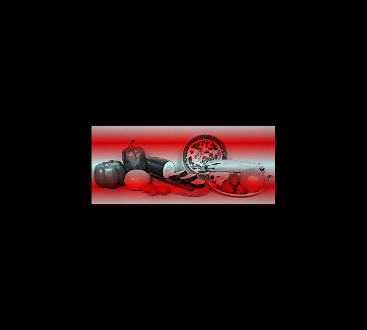
Here
are three more examples of images which use only white and
red light. The first is from an image Land used in the 1977
article, scanned and converted into retinex here. While
compiling the earlier images from the original separations,
I wondered what ordinary color snapshots might look like if
converted into similar two channel pairs. So I grabbed the
original photo a friend took of me with Nago in my lap, one
from the same photo session that the index page photo came
from, in fact, and another taken this past Christmas with a
small digital camera. These had a lot of warm tones
contrasted with cooler colors, and would be reasonable
examples to get away from the more common still lifes with
which Retinex is usually demonstrated. I yanked the blue
channel from each original Photoshop file, then sized each
to reasonable web page size, allowing for a generous black
border.
The next step was to
save two new files, one with only the red channel remaining
(convert to grayscale), and the other with only the green
channel present (again convert to grayscale). Now reopen the
red image, convert it back to RGB. Select only the green
channel and fill it with 100% black. Do the same with the
blue channel. The RGB view ought now look like that one
above in the merging example, an image that's all in shades
of bright red down through black. Save that version with a
new name. Reopen the green file, and change it also to RGB.
I like to select the red channel and fill only to 15% with
black, as this removes a slight bit of the red bias in the
final view. It's exactly analogous to adjusting the color in
that shot that Scientific American used on their cover,
reducing the red somewhat (i.e. adding cyan) overall, so
that neutral objects become neutral once more, and it
affects nothing else much. Our eyes do the adjustment
automatically for us when we view such a situation.
These were next
combined with a horizontal grid image that I first had to
make by hand, tediously, when doing the original images
above. Big bore. I'll include one of these grids for any of
you who wish to experiment yourselves, a file you should
download and save (or
drag to the desktop to save a copy, if your system is so
setup). You can
increase the width just by stretch-scaling the image. To
obtain a taller version, open it into the window size you
want and copy and paste it to fill the new height. Be VERY
careful that you butt the images exactly together. You'll
see it right away with such an even pattern. If the two
sections are not properly aligned, there will appear a
glitch in the overall grayish impression, usually a darker
or lighter stripe that the rest of the grid. This is a
horizontal grid, as I've been using. Reason for that is my
Trinitron monitors use vertical stripes for the RGB colors,
and although these are very, very fine, the can create
what's called a "moire" pattern when presented with a
similar vertical grid. So horizontal it is, not the same
sort of problem.
Open and
then save the grid image which appears, or just
click here.
You will then open the
grid image you got from the above file, select it all and
paste it over the red image file, the one that looks overall
red. Choose "darken only" and the grid will be superimposed.
Flatten it (these are all Photoshop instructions, but most
similar programs have similar commands). Open the white or
slightly blue tinged white image and again paste the grid on
top. Choose all and invert it (so it will be dark where the
version over the red is light, and vice-versa). Choose
"darken only" as before and flatten. Cool. Now copy one of
them and paste it on top of the other. Choose "lighten only"
and again flatten. You can then enlarge the canvas with 100%
black by several inches and save. This version works great
on screen on in a web page. I save space by converting to a
128 color gif with auto adaptive color selection on, but
please, no dithering! Even if you're just going to print it
out a black border of some kind will help. If you want to
save expensive inkjet ink, just cut carefully so no white
surround is left and paste the printout on a sheet of black
construction paper. Congratulations, you've made your first
Land Retinex two-color print!
Anyway, the two images
that start this section (click on the thumbnails above, of
course), will pretty well fill a smaller monitor screen, or
most of a larger one. Scroll if you have to recenter the
final image. Then grab the two short lengths of cardboard
tubing you used above (you did try that already, didn't
you?), put them nearly side by side, and hold them up to
your eyes so that everything is blocked out except the given
image. Since the grid is rather coarse, it will work better
if you move back from the screen a little ways. You'll see
two natural images with no manipulation which exhibit a
notable range of colors, even though you're eyes are really
only seeing two B&W views, one through red light, the
other through white. Perhaps not astonishing, as you do
really need three colors for deep rich colors, but damn
interesting, just the same, don't you
think?
|
(Top
of the Page)
|
8)
Quo Vadis?
|
The
CIE Diagram
(Optimized
simulation
for RGB monitors)
|
Just
because this whole discussion could be squeezed into a not
so large web page doesn't mean the topic is exhausted -- not
by a factor of hundreds! If you want a fuller story of
what's going on here, CLICK
HERE. One can
spend many an entertaining and thoughtful hour trying to
extrapolate ideas and concept about our amazing human visual
abilities. It's something like what alternative tuning
should be for music composition, this can be for creating
new images and graphics, providing new mediums to explore
from. The processes are fundamental and underlying, not
something painted on superficially. It's much more important
to try to come up with something deeply compelling and
provocative -- and "new" will follow. Sure wish so many
artists were not so desperate to be "new," as to be "good"
or "interesting." Sorry that I'm not more of a graphics
person myself. A good artist might try to extend our
horizons using such widened understandings. The intuitive
curiosity that can blossom forth from true scientific
discovery has often served as the fodder, the inspiration,
for new works of art. The idea turns me on, anyway.
I had hoped for years
to meet Edwin Land, to show him the undergraduate stunt of
an oil painting, to ask his opinion on several questions I
still had. But, no, I've always been too shy that way, and
the occasion just never came up. I felt regretful when I
read in the early 90's that he had died, after continuing
his constant inquisitive adventures way past retirement from
Polaroid. Land had formed the wonderfully undogmatic
"Rowland Institute for Science" in Cambridge, MA. A good
friend with a similar mindset, it turns out, had know him
and could easily have arranged a meeting during the 80's.
But I learned of this potential connection too late,
although some of the stories were/are still lovely to hear.
Rowland continues to investigate many of these "bits of
business" that some of us just seemed doomed by our
curiosities to explore. Better, they have the know how and
funds to do it properly, instead of the meandering, homemade
paths mere amateurs like me must follow.
There's another
related, but also rather different story than what we've
been speaking about here so far. It involves yet another
viewing box experiment I've been fooling around with for
nearly 20 years. I always wanted to find a way to duplicate,
or at least nearly
duplicate, the sensations of hue that a color dificient
person (dichromat) would see. In the late 80's I did come up
with a viewing light that seems to work well, and
have
described in on the next page.
It's another tricky project, but well worth it. It's also
gratifying to discover how well we can perceive a nearly
full range of colors from a pallet that's been limited, as
it indicates happily that a "colorblind" world (limited to
just two colors) remains still quite colorful (more of this
on the next page). While it will lead to problems at times,
it's less of a mental & perceptual loss than is commonly
assumed.
Eventually I'll return
to other topics about color vision, and describe some other
lively tests and demos you might enjoy fooling around with.
I discovered a few years back that Edmund Scientific has
made available some dichroic mirrors at modest cost and
bought a few. These are multicoated small glass squares
which reflect certain colors while allowing others to pass
through. It's one more "neat toy and tool" (aren't they
all?) that might help solve other questions which naturally
arise in a meaty subject like this. Perhaps something
reasonable will come of it, perhaps not. Meanwhile, don't
just read through these descriptions, jump in and try them
out yourself or with your more curious friends. Let us know
if you find something interesting!
--Wendy
Carlos
All
original images scans from Land's articles, except where
noted:
©
1959,
1977 Scientific American Inc. -- All Rights Reserved
|
(Top
of the Page)
 Back to the Wendy Carlos Home Page


