

|
|
A Difficult Mapping A Deceptive Map A Practical Map for You Album Cover Sketch The Mapping it Uses Some Map Books |
|
For
some reason or another, maps and mapping have always been a
fascinating topic for me. As far back as I can remember,
I've been astonished to see those miniaturized copies of the
world (now other worlds) around me, on a modest-sized piece
of paper. Just by looking at one you can figure out where
you are probably located, and from there what direction to
head to get somewhere else, toward a distant goal, most
likely a goal depicted on the same sheet. (Of course these
days we also have GPS, but one still needs good maps!) |
|
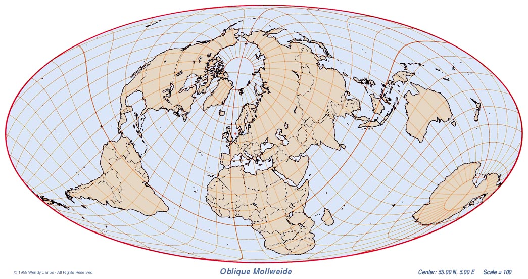
In
much the same way that my Eclipse
Page
started small and then expanded slowly over the past three
years, let's begin with a few examples of some interesting
(well, they are to me, anyway... ;-) maps and their
projections. In all of them the actual land forms are from a
database of the world's coastal outlines and country
boundaries. At the time I began, 1976, there were no compact
sources I could find for such things -- home computers had
just begun to appear -- so I had to build my own.
|
|
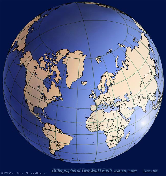
This
next example contains a sneaky trick or two. It's been made
to look three-dimensional, and oriented here to give you an
unsubtle view of the trap. If I held such a globe in front
of you, untilted, and perhaps gave it a very slow complete
turn in my hands, and asked you what you saw, what would you
describe? That it's obviously a globe of the Earth, a pretty
blue and beige one. Kinda shiny. And wot else...? (This top
view was deliberately plotted to make what is going on here
rather obvious...) It's funny that many people without a lot
of geographical and map experience will miss spotting at
once that this is a double Earth -- every location appears
twice!
|
|
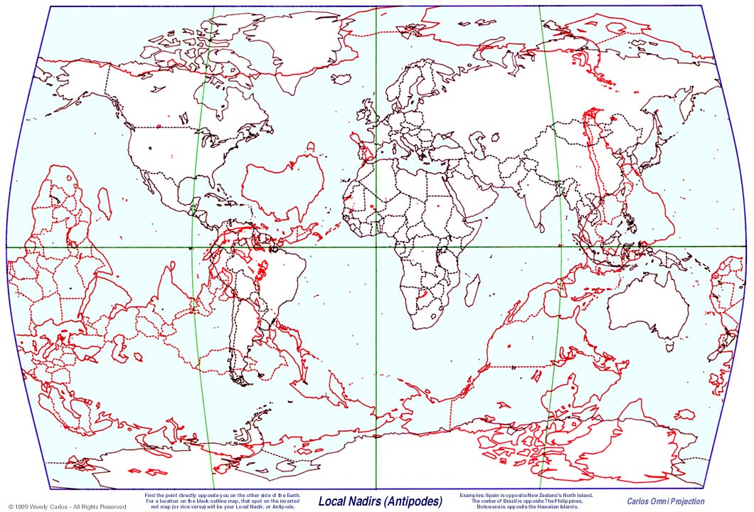
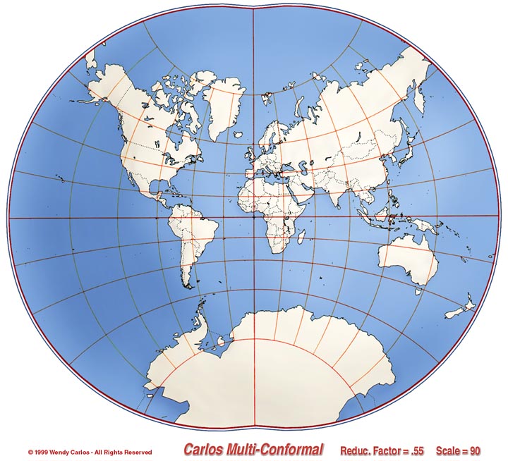
Now
let's look at a much more practical map. This one is
designed to show you, very quickly and easily, something
that friends of mine had spoken about since I was growing
up. Perhaps we are all influenced by the old saw that jokes
about "digging a whole all the way to China". Have you ever
thought about what that really means? Not only about the
Earth's core being molten iron and such. About where you
actually might come out if you could perfect your digging
prowess to an astonishing degree?
Find the point directly opposite you on the other side of the Earth. For a location on the black outline map, that spot on the inverted red map (or vice-versa) will be your Local Nadir, or Antipode. (P.S. Now you can see that if your mom or dad or friends HAD been right about digging straight down "all the way to China," you must have grown up in Chile or Argentina... Q.E.D.) |
|
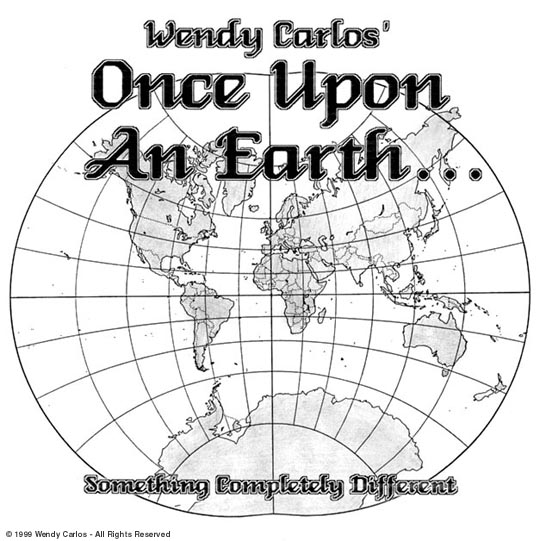
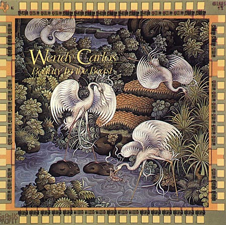
Here's
a subtle map projection of my own that for a while I
entertained using as the background image on a new album of
music I was then composing. The album underwent a fairly
lengthy path before being completed, and it accrued a few
temporary titles. Once Upon An Earth was one of the
first, as I recall. My generous pen-pal Arthur C. Clarke's
later gave me permission to use one of his book titles from
one of my favorite novels of his: "Songs of Distant
Earth". What else to call an album inspired by the music
of our world (this well before "world music" was even a
category -- I seem to be always cursed as ahead of my time,
dammitt..)
|
Wendy
Carlos Map Page
©
1996-2007 Serendip LLC. No images, text, graphics or design
may be reproduced without permission. All Rights
Reserved.
![]()