
 Wendy's
Artwork Wendy's
Artwork
(Click on any
bordered image for a larger view)
|
Drawings
   
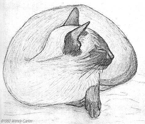
 Although
I'm only an amateur artist, I've enjoyed making
pencil sketches all my life. I've dabbled in
most of the media available before computers,
and now with that, too. A few years ago I made
these renderings of two of the fuzzy critters
here, Pica, a chocolate-point Siamese, and Nago
(her son), a seal-point. They were done with a
medium lead pencil on bristol board. Although
I'm only an amateur artist, I've enjoyed making
pencil sketches all my life. I've dabbled in
most of the media available before computers,
and now with that, too. A few years ago I made
these renderings of two of the fuzzy critters
here, Pica, a chocolate-point Siamese, and Nago
(her son), a seal-point. They were done with a
medium lead pencil on bristol board.
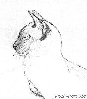
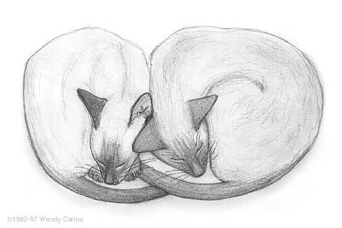
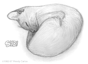
I've finally
found some of my other drawings of the cats
(hooray!), these drawn on high quality vellum,
which I was trying out at the time. Below are
two of them, pencil sketches of Pica ("Peek")
curled against Subi, and one of Subi asleep
alone. When I was recovering from the broken hip
I got in our freak auto accident in 1982, our
friend Carol Donner suggested I try drawing to
occupy me when I could only sit or recline. Good
ways to get the brain going again, too, and I
thank her for her empathetic "therapy" (Carol is
also an excellent artist, who works in many
difficult media, unlike my self-taught
scratchings.)
 

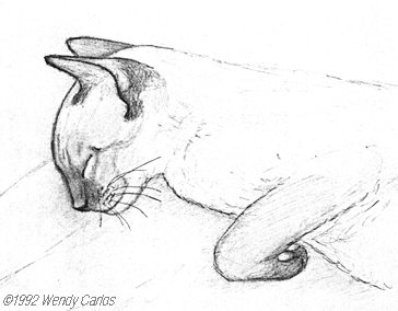
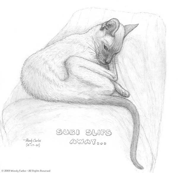
Subi slips away
The
time I've been dreading finally arrived. Subi,
the eldest of the original four critters, the
tough little cat who outlived all his friends,
is no more. He nearly reached 20 years old (6
1/2 weeks short), which is pretty amazing by
itself (I've been told not much more than one
out of 100 cats attain that age). You can also
see how thin he'd become in the last two years.
For more on saying good-bye to a dear feline
friend, look at the photos and text on the Photos 2 Page. To see a larger view
of this pencil sketch I made on his final
evening, as he lay quietly on my lap, just click
on the thumbnail view here.
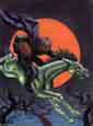
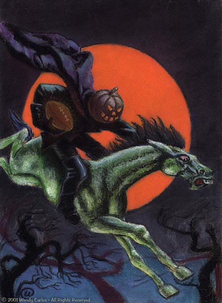
Here's
a pastel image, which I drew while I was in
college. It's a tongue-in-cheek takeoff of the
famous Headless Horseman, and was based
on a magazine parody illustration I had come
across. With the jack-o'-lantern up on the
horseman's neck, the idea of putting a football
in the rider's right hand, about the way a
player might actually run with one, seemed to be
a clever idea at the time. By now the original,
which is about 11" x 17", is showing some signs
of wear. I retouched just a few of the worst
smears in the dark sky and orange moon (pastel
isn't very durable, after all!) after scanning
the original drawing, and the final quality's
surprisingly good. Notice
the distinct look of soft pastels and pastel
pencils on charcoal paper. And that odd
"curlicue" near the bottom left is how I usually
signed my stuff back then, my initials stylized
into a visual pun on the symbol: @.
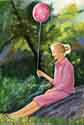
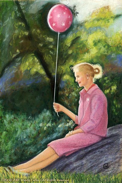
Before
completing the above Headless pastel I was
trying to teach myself how to capture the
feeling of light and shadow interplay in a
drawing. It was as far as I got into an
"Impressionistic" phase of the engrossing hobby
of drawing. My dad used to collect a lot of
illustrations and photographs that he also used
as reference for much the same purpose for his
drawings. We were sort of two amateur artists
trying to learn from and with each other. A lot
of pleasant memories there for me, you bet. One
of the reference color photos we came across
showed a young woman sitting in Central Park,
holding a bright pink balloon. The parts that
caught my eye were the strong backlighting and
soft focus background -- not so easy to draw...
Ah-HA! This
would make a most engrossing study, to try to
draw a reasonably faithful version of the photo,
using the pastels and pastel pencils, again on
charcoal paper. I'd completely forgotten about
this image, until a couple of weeks ago. While
digging through some tall thin papers and
cardboard and books, I discovered a matte frame
my dad had given me some years ago when I went
to visit both of them. It was while I was
running for the Amtrak, so I hadn't had a chance
to look through all of the small stack he handed
me. Somehow this face down part of the stack
escaped me when I got back home. I'm delighted
to find the drawing again, long after the fact,
and discover that it wasn't a bad early effort
at all. I've scanned the 11" x 17", as above,
done some mild cleaning of a few places where
the none too durable soft medium had gotten
slightly smeared, and present it to you above, a
click away. Like Rossini's modestly titled late
collection of some of his early music, this is
one of the "Sins Of My Youth." Yup, the same
curlicue appears at the bottom right, explained
in the Headless drawing, right above this one.

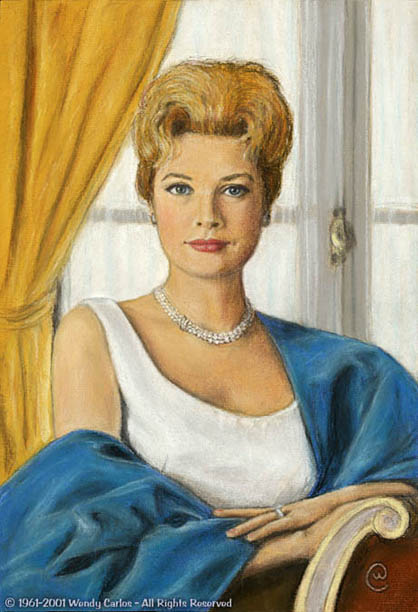
But
one early pastel I had not forgotten about is
this, of Princess Grace of
Monaco.
It used to hang in my parent's downstairs rumpus
room, as those suburban miscellaneous spaces
were called. I remembered it as the best color
pastel drawing I had done during college, and
would have loved to see it again. My dad and I
searched for it several times, but it seemed to
have vanished years ago. Perhaps it was damaged
or taken down when the room was repainted, and
then misplaced. It may even have been "borrowed"
by one of their visiting friends, as some said
they'd like a copy of it. No matter, I never
expected to see it again. That went double when
my parents recently moved to their charming new
apartment, and sold the old homestead. It never
surfaced during the move and cleanup.
But I was
wrong -- here it was, carefully filed by my dad
along with the above drawing within the same
protective matte frame, face down, unnoticed for
years. He hadn't even realized it was tucked in
the other drawings. Sometimes when you dig
around for other bits you strike a serendipitous
chord, and *hey bingo!* you come up WAY better
with what you do find, than what you were
searching for. I greatly admired Grace Kelly, as
many Americans did. Very intelligent and
talented, she exhibited the grace of her name in
everything she did. I love her work with
Hitchcock, and he never did again find anyone
who could hold a candle to her, imho. In the US
we all accepted her move to Monaco and into real
royalty, although we missed her presence in
motion pictures. It was an emotional shock when
she died in that automobile accident some years
ago.
Back then I
had no good models to pose for me. When I
spotted the original photo in a magazine it
seemed a wonderful challenge to draw her
likeness. It was difficult, and my technique
grew during the experience. It's surprising that
I can even place the exact time I drew it. We
were downstairs, watching the JFK Inauguration,
during a heavy snowstorm which blanketed the
whole NE, that January 20th. I was working on
this drawing that very day, trying to do two
things at once as usual. Hope it's worthy a
smile to see it here, hi-res scanned and
slightly cleaned due to several rubbings and
bits of dirt picked up during 40 years (yikes!)
of storage.

Above
is a recent drawing that I made after learning
of the death of Stanley Kubrick, on March 7,
1999. It's very simple, a pencil sketch on plain
white paper, drawn fairly small so that it would
show up well at smaller size (very large
drawings tend to look like all the detail is
missing in screen-res reproductions, I find). I
wanted to post some observations about my experiences of
working with this legendary director, and
thought a drawing I had actually made myself,
however mediocre, would be a better personal
touch than one of those often-seen photographs.
I'm sorry
that I'm not a better artist, and that I was
unable to get the resemblance quite right,
although certainly "it's in the
ballpark"(Stanley loved to use sports jargon.) I
tried to capture him as I remember him, from
some time in between "A
Clockwork Orange" and "The Shining", the two films I
worked with him. Later he wore glasses quite
often, his hair got whiter and sparser in front,
and with a few pounds of weight he gained during
the final year or two, I was told by a mutual
friend he had begun to look more and more like
Henry the VIII, or even Falstaff, not such a bad
pair of British images, where he lived most of
his life. Of course when he spoke, what you heard was
vintage educated New York-ese...

Next
is one of my rare older oil-paintings that I
still can locate. It was painted when I was
still an undergraduate and taking an art course
at Brown University, taught by Professor
Roberts. I enjoyed the survey of mostly modern
art, getting a better overall idea of which
painter or sculptor followed whom, was
influenced by or influenced whom, and where the
usual temporal fence posts could be erected
between the various "schools" and "periods" of
art. The concept and lessons have lasted me a
long time. To be truthful, I'd picked up some of
it from my parents, who were also very aware of
art and music and literature. My father has
always enjoyed drawing and studying many mediums
of art at home, so he had a lot of good books I
used to enjoy reading through.
The class
ended with a major class project for each
student. You had to propose something you would
make or create, using whichever media you might
choose to work with, and write a short paper to
describe the piece. Those who could not paint or
draw could instead opt to do a nontrivial art
analysis, writing a paper which described their
investigations. Since I could draw a bit, I
chose the former. But since Professor Roberts
had always seemed interested in the newest
strides, concepts and media, I tried to aim in
that direction, trying something never done
before. What he gave me permission to complete
must have sounded a little mysterious to him,
but I was encouraged to go ahead, hands-on.
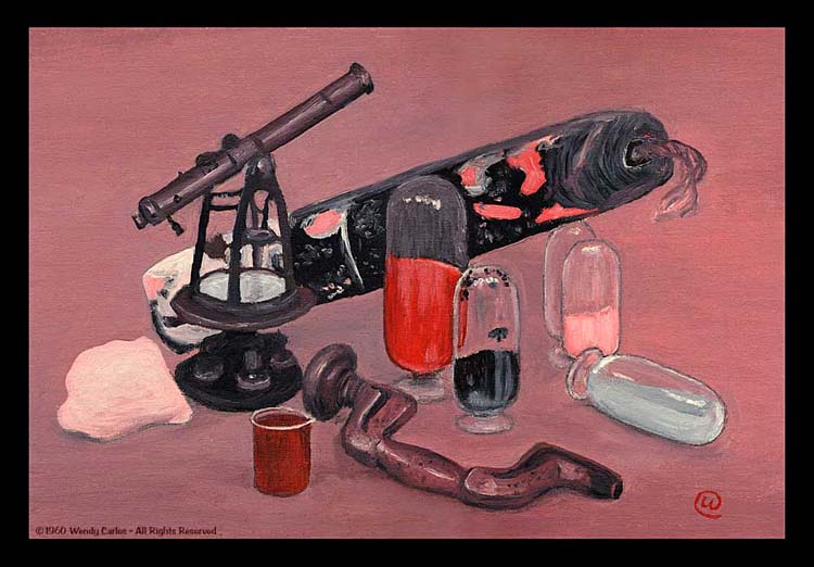
You'll see a
larger version if you click the above mini image
of the painting. It also happens to demonstrate
something that was right at the cutting edge at
the time, the Retinex Theory of color vision,
developed by Edwin Land, of Polaroid Company
fame. Seen under a small
spotlight the still life shown here looked to be a
perfectly reasonable color painting. There are
tones of red and purple and yellow and blue and
green and orange, as well as neutral grays and
browns. Yet there were only three tubes of
pigment used: red, white and black. You can read
all about what's going on, and get a pretty good
impression of this simple little painting and
how it made its own modest contribution on our new Color Vision Page. But don't forget to
return here again for the other examples
continued below!
|
 (Top of the Page)
Photos

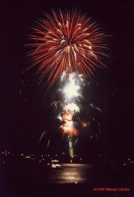
In the mid 70's I got my
first really professional camera, a Rollei
SL-66
2-1/4" affair, like a slightly bigger and
"techier" Hassleblad. (Rollei still make a version
of it, but the price has risen beyond belief!) I'd
found a good condition used 250 mm tele lens for
it shortly afterwards, and was anxious to try it
out. A few friends and I staked out a perfect spot
for the 1976 Bicentennial July 4th fireworks
display, from the opposite shore in Brooklyn
Heights. The pyro spectacle that one year was to
be set off over the Statue of Liberty, in keeping
with the USA's 200th Anniversary.
I got off quite
a few decent exposures, mostly short time
exposures (the camera was on a large tripod), and
above is one of the best. You can see the statue
just below all the flashes and color-crazed
bouquets of light and pomp. Beneath the image of
Miss Liberty note the glint of water in New York's
bay, with a few light trails from small ships
which moved slightly during the exposure. It was a
display that was definitely worth the buildup, and
none since has seemed quite so grand!

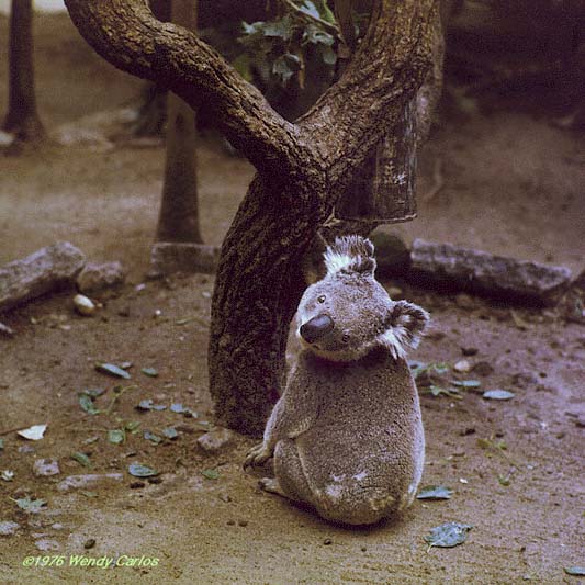
I brought the Rollei SL-66
with me on my second trip to Australia, in October
of 1976. I was with a few other eclipse chasers
(yes, we were successful on that part of the
trip), which by the random odds of the moon's
shadow placed us back in that country in just over
two years (June 1974 we'd seen the previous total
eclipse from a 727 jet near Perth.)
Lois Nelson and
I were outraged when it became clear that on this
second trip there were no plans to see any koala
"bears". This was shortly before Quantas had
popularized these marvelously plodding and
soft-furred critters, and they were not yet
synonymous with travels "down under". Lois made
several phone calls, and discovered that just
northwest of Sydney was Koala
Park, a
preserve that had most of Australia's marsupials
and other unusual fuzzy-folk in a natural setting
open to the public. We hired a taxi for the
afternoon, and sped over the Sydney Harbor Bridge,
grinning like Cheshires.
Despite the
Spring drizzle and a drippier head cold, I had my
first decent close-up look at koalas (they smell
like cough-drops, will allow you to pet them if
you have a tempting eucalyptus leaf in hand, and
are certainly not as swift and alert as a Siamese
cat...) We also got a good look at dingoes,
wombats, platypuses, lots of 'roos, and a
surprising number of birds. I used up several
rolls of 2-1/4" film. This cute little guy is from
a Cibachrome print I made, currently hanging over
by my trusty old LaserWriter.
|
(Top of the Page)
Whimsy
Memorabilia
Dept. -- Two Buttons
Ya' got me, these buttons aren't something I
made, but rather are two whimsical mnemonics of
the time I got them. There was no other spot on
the site that seemed to fit these quite so well,
so here they be. The one to the left below was
handed out to hundreds of us at the Time-Life
Building in NYC, mostly residents who in those
pre-cable days couldn't obtain unghosted
television broadcasts among the steel towers of
Manhattan. It was the evening of July 20th, 1969.
A sultry, overcast night fell upon us, as did a
few showers, which only added to the heat and
humidity discomfort. Life magazine had
thoughtfully set up a huge projection video system
on the new plaza (which was near completion) for
the public to view the coverage of the first
Moonwalk.
Rachel Elkind
and I had a quick dinner midtown, and then walked
to the corner of 6th Ave and 50th, to see if the
view on their big screen was any better than the
poor reception back on the small B&W monitor
we had in our studio. It WAS better --
surprisingly decent, with a clear sound system to
complement the fancy Eudiphor video projection
unit. And there, surrounded by a large, spellbound
crowd, we watched Neil and Buzz make their
historic "small steps" for us all, even those who
only gasped and cheered and cried there that
Summer's eve.
You know, I've
kept that large button ever since (shown actual
size here -- sorry the moon's upside down...), as
a memento of what seemed to be a more hopeful,
optimistic time than this regressive period we are
currently doomed to endure while the decade first,
and then century/millennium increment by one each,
in other small steps. (Nostalgia? You bet!)

The much smaller
button to the right above came a couple of years
later. I couldn't find one at first, but a friend
saved me one, and this is it. I'll not soon forget
the odd way much of the recording and music
industry "greeted" stereo sound (the operative
word is pronounced: "Feh!"...). We noted a general
reluctance to adopt stereo in many venues through
the 60's, even as those famous wall writings were
plain and clear to see. As Arthur C. Clarke so
aptly says: "It is always wise to
cooperate with the inevitable. Better still, to
exploit it!"That's a dandy -- keep it
in mind.
With
tongues-in-cheek a few studios began displaying
"Back to MONO" slogans on the walls in hand
lettered signs. We all grinned knowingly. It was
only a matter of time before some enterprising
soul put out these buttons. I heard rumors of
several engineers and producers who claimed
credit, like Phil Ramone and Phil Spector
(interesting coincidence -- the two "Phils" --
wonder if they're tenors? ;-), but could not
confirm it. As a droll reminder that progress has
NEVER been easy, I keep this pin/button around,
just to maintain perspective. You might get a
smile out of it either way: if it's new to you, or
if this stirs similar memories in your head...

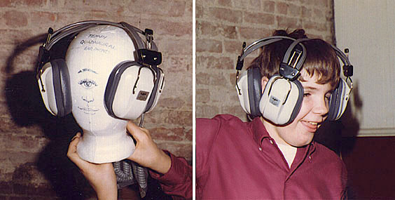
At Last-
It Can Be Revealed!
The TRUE reason that Quadraphony failed
in the '70's!
As a joke gift to a CBS Records producer who
was championing a pseudo quad system at the time,
CBS's "SQ" (we wanted a true discrete system
instead, a topic for another time), Rachel Elkind
and I put together this absurd contraption. It's a
four-eared quad headphone set, which we called the
"Tempi Quadnaural Earphones" (Two channel phones =
Bi-naural, so four channels = Quad-naural...)
One feature
which wasn't immediately obvious is that once the
race has evolved to have four ears (yes, I drew
four of them on the Styrofoam dummy-head), there
will be room only for a single cyclopean eye.
Since this glorious day has not yet arrived,
current homosapiens is presented with a bit of a
challenge, as our young, hammy friend demonstrates
on the right portion of the larger photo version.
Anyway, now you know.

Astronomical Cover-Up!
Sources inside the Jet Propulsion Laboratory
revealed recently that the lab had agreed to a
"cover-up" of sensational images recently
processed at JPL. On the heels of the
controversial "Face on Mars", comes further
scientific evidence from the Clementine Lunar
Probe of an even older "Face on the Moon". Dated
as over a billion years old, several features of
lunar terrain clearly form the visage of a face,
with two eye-shaped regions, each hundreds of
miles in diameter, looking skyward, above a
surprised expression of some kind in a region best
described as the "mouth". What is it trying to
tell us?
Skeptics say
this is purely an figment in the mind of the
viewer, and that all these formations are a result
of natural processes, like meteor impact craters
or lunar volcanism. Proponents counter that the
image seen here (after enhanced new computer
imaging techniques) is evidence of
extraterrestrial construction, proof that our moon
was once visited by an ancient space faring
civilization.
In an effort to
shed light on what they call an "awesome discovery
and government suppression of evidence", we are
proud to release this contraband image newly
smuggled out via the Net. Details should be
forthcoming on the first of April.
|
(Top of the Page)
Via
Computer Graphics

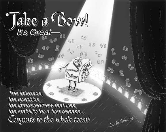
"Take a Bow", is the title of the
above image. It was drawn in isolated bits and
pieces on white paper with a medium lead pencil,
and then these components were scanned into
Photoshop. There they were toned (some elements
got reversed into negative image versions),
layered, and assembled into this final view. The
light effects were added using the Wacom tablet,
as well as the beam of spotlight effect "drawn-in"
on the final composited layers. Some of the
clapping hands were scaled and rotated and copied
to obtain several extra versions. Finally the
dimensional text was put together in another layer
and placed on top. The whole thing is part of a
"round of applause" I wanted to send to my friends
at Mark of the Unicorn during 1994, when they
had just introduced a gorgeous and significantly
enhanced version of Digital Performer, my (not so) "secret
weapon" in making and shaping music and audio...
And it continues to fascinate, inspire and provide
many of us in these related fields with more
powerful creative tools than we'd ever imagined
possible.

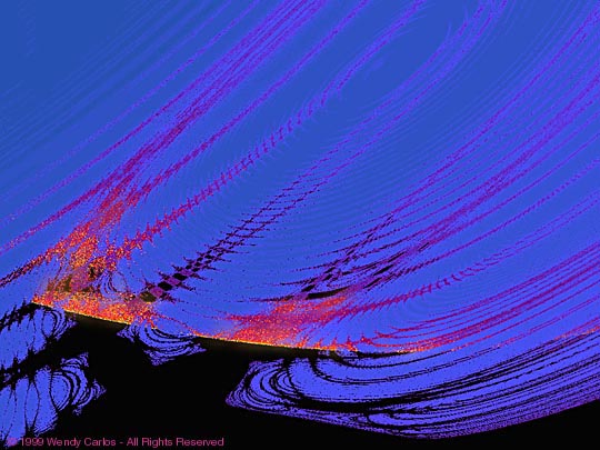
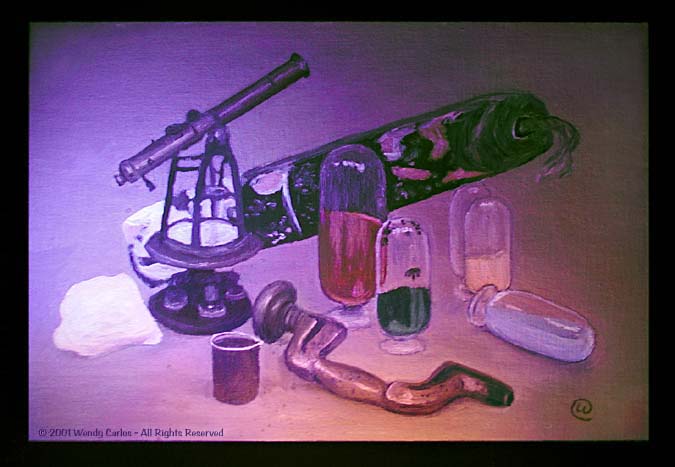
"Fires of
the Gods",
seen in the small view above (click it to see a
large view, as usual) is a JPEG reduction of an
experimental work involving Fractal Sets. This
time the set was not the usual MandleBrot Set, but
a far less well known one plainly called the
"Wayne Set". Most of the images you can find on
this numerical construct are not nearly as
interesting as those on the more popular set, and
it never will supplant it.
Evenso, it does
allow one to create a few rather striking images.
I had to explore for many hours to get the above
view, and then I designed a custom KLUT (color
lookup table), to give this nightmarish image a
deep visage, like a lost scene from Disney's Fantasia. After generating the
high-res version, I popped it into Photoshop and
there made many small handwork enhancements and
retouchings, to come up with what I thought best
expressed the concept I had been trying to get. A
few properties, the "hash" in some of the brighter
colors, was impossible to remove entirely, but the
overall effect is still good. Might make a
handsome cover or art piece for an album someday.

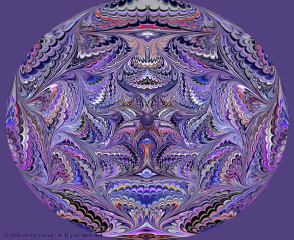
Don't you just love the
look of marbleized papers, the endpapers you find
in beautifully bound books, or as a background
pattern or texture in books and magazine? I always
wondered what this art form was all about, how the
lovely intricate, but systematic patterns came to
be. The solution just fell into my lap when I got
the version 2+ update of Fractal's Painter program, now available
through Corel. The manuals explained all,
including a brief history (in a charming
illustrated bonus booklet -- wonder if it's still
available anywhere?) about this ancient art from
the Middle East.
I'd been using
Painter with a trusty pressure sensitive Wacom
tablet to create natural appearing media imagery
for a video project I became involved with in
1993. Later versions have the capability, too, of
course, if less conveniently. I used to keep a
version 2 and also version 3 on CD-R or a HD
partition, to add many neat tools to my Photoshop
work. Now I more often just use Painter X, which
is quite good.
This image
above uses Painter and Photoshop, and took some
patience to get just right. It's a polar
coordinate mapping of marbleized features, with
unexpected symmetry, all in violet, aubergine and
related cooler spectral tones. It's another image
created while trying to perfect some skills at a
new software feature or two, but now keep around
for the dumb reason that "I like it". You may
discover a version of it inside a new album I'll
put out someday. Never can tell. Better still for
now, take a look above, with a click to enlarge.
P.S.
Just to
bring this description up to date, Painter was sold to Corel in the
early 2000s, and they still maintain this lovely
program. (Metacreations also still has a page
online that links to the newest locations, with
some interesting background info, too.) And my
ever stimulating friend, Kai Krause, who
distributed Painter for a few years after Fractal
abandoned it, has resurfaced (yeay). He's been
working on several elaborate new digital projects,
originating from the heart of Europe, with a
company called ByteBurg. Lot's of good people out
there!

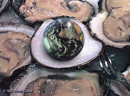
"World is my
Oyster",
above is a JPEG of an image that is both a visual
pun, and a subtle use of Photoshop trickery. The
overall image of oysters is assembled from scans
of several 2 1/4" photos I made here one dinner,
when we were lucky enough to find some fresh local
ones. The fork was photographed separately. The
globe of Earth is a hand-painted version of the
famous Apollo 17 photo. I've gotten tired of
seeing the same cloud formations, so did the
rendering here "in the style and spirit of" the
original, but all different. The shadow and many
highlights and detail, as with the the Earth
globe, were drawn using a Wacom 6" x 9" tablet, to
allow a natural media look and feel you can't get
with a mouse or trackball. And, oh yes, the idea
itself has been hanging around in my head for a
few years, and I just had to make this image to
"exorcise" the thing out into reality.

Here are two images of the
planet Mars. Hardly anyone seemed to
have noticed that in the Summer of 1995 we passed
an important U.S. Space milestone. It was the 30th
Anniversary of the historic Mariner 4 Encounter
with the red planet, on July 14, 1965. I still
remember being at Columbia University and finding
a buzz-on from some people at The West End Bar on
Broadway one evening. The first images from
Mariner were being published in the N.Y. Times. We
all gathered around to look and chat excitedly
about this "giant step", and the future. A
wonderful time to live through, indeed!
Recently, while
searching for something else in an old stack of
papers, I came upon a long-ago set-aside issue of
Time magazine from July '65, featuring the Mariner
4 early results. It refreshed my early excitement
and wonderment. Out of curiosity I began looking
online for more information about Mars. There's a
lot there, more every month. A few choice sites,
maintained by JPL and NASA (starting in the early
90s), post some fine, cogent, Mariner Anniversary
information, and the more recent Martian probe
results. Several sites also store copies of the
image databases from the mid-'70's Viking Orbiter
Missions. I downloaded a few which had the same
region as that in the famous picture #11 that
Mariner 4 took, and then went at them with my Mac,
just for fun. (If I ever do this again, obviously
I'll start with more recent raw images.)

After rotating and
stitching together three or four overlapping
adjacent images of Mariner Crater (as it's now
named), after carefully manipulating the
perspective, scale and angle of these, I managed
to match fairly well a Mariner 4 image I found in
an old astronomy magazine of the original 1965
best shot, #11 (scanned and fine-tuned). So the
B&W comparison image above is a side-by-side
view of what was first seen by Mariner 4, and what
much better cameras took 11 years later, processed
with mid-'90's software. The color image just
above is the wider angle view, in near natural
color, that I finally came up with. (Surprisingly,
the newest Mars orbiter images are not much better
for this region.)
The saddest
comment on all of this is that we didn't get back
(successfully) for any closer, clearer images for
22 years after Viking. Fortunately, there have
been several successful probes, orbiters and
landers, since the late 90s. Even so, after
abandoning the achievements of Apollo (we couldn't
build an equivalent to the Saturn Rocket right now
if we tried (!) -- the technology, the
plans/blueprints and the people who did it are
long gone), the west has lost much its appetite
for curiosity and adventure, for the moment. I
wonder what might bring it back, more spacewalks
and a Lunar landing by China, perhaps...? (Nah...)

Postscript: We've recently
discovered a wonderful new website of NASA's
containing all of the Mariner 4
images in high res, and many other
historical astro-images collected since then (this shot, 11e, is found on page 2 of
the above link). You may enjoy browsing their whole
site for yourself (bring the kids). Armed
with much better raw image data from the famous
pix #11, I thought it would be amusing to
hand-tweak it much like the above earlier versions
had been optimized, and upload it here. So above
we have a "new" look at the same 1965 breakthrough
photograph, looking about as good as it ever will.
You'll see there's more detail, and both highlight
and shadow regions are not so blocked up as
before. The visual impression is rather closer to
the Viking based image in the first comparison
jpeg. We hope soon to see some Galileo images of
the same location on Mars, and those ought be
truly spectacular! (Update note: and so this came
to pass, and continues to the present, images of
the Saturnian system, rovers on Mars, and a new
Mercury probe currently heading for its close
encounter with the planet nearest the Sun.)

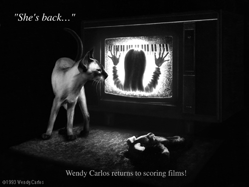
A few years ago my friend
Linda Livingston at BMI (in LA) wanted to help me get me back into
scoring motion pictures. I realized that living on
the East Coast might be an obstacle to that, but
thought it might be fun to do another score using
some of the new tools and technologies I already
use regularly (got the chance when I scored the
independent feature for some film friends,
"Woundings" aka "Brand New World"). How about some
neat exotic tunings for a sci-fi or horror tale?
Or smooth justly tuned harmonies for a smooth love
story? Hmm... okay, we needed some sort of
mailing.
I put together
a small "Press Kit", with a bio and credits, and a
cassette of excerpts-- all the usual. Linda had
been making me laugh with her variation on the
line from Poltergeist: She's
Back!, so as an attention device we came up with
this image. I used Photoshop to combine a scan of
Pica in a cute pose, with my air-brushy drawing
based on the promotional cover of the sequel film.
In the process the sweet little girl looking at
the TV set got replaced by the dour back of my
adult head, this time inside the screen with a
keyboard. (Well I thought it was
kind of funny!)
|
(Top of the Page)
Early
Macintosh

We got our first Mac in
March of '84. I began using it with MacPaint
almost immediately. This is a Christmas card cover
I did, with the four fuzzy critters around a tree.
I drew several versions, and this was the
simplest. It was tricky to draw with a standard
mouse and no gray scale pixels! I'm rather
amazed/amused I could still open the file after
all these years, and turn it into a valid GIF
format for you to see!

Much
later, having been customizing the icons on my Mac
for years already (using ResEdit, natch!) I
updated these versions in color. I'm still
surprised by how many people who come here comment
on them when they see my screen. Alas, Heather
dog's image on the card above was too large to fit
the standard icon space!

After reading Arthur C.
Clarke's novel version of The
Songs of Distant Earth, I wanted very much to
compose a music project deserving of such a fine
title. First I wrote to ask Arthur if he'd mind.
Generous to a fault, he said there'd be no
problem, and encouraged me. (The music went on to
become Beauty in the
Beast, but that's a long story.)
The cover art,
when it was still going to become "Songs of..."
was something I toyed with for a long while, as
the music went underway. I drew this little
MacPaint image above to show the people at CBS
what I had in mind at the time. But somehow it
never clicked. Then Mike Oldfield went on to use
the same title. A good idea whose time had come, I
guess...
Another aside
is that I'd planned on starting a small record
label when my CBS contract was through (sound
familiar?) The logo was going to be our tiny
critter, Pica looking into one of my Grammys. So I
drew that in. I still have the photo I took of her
doing just that, playing "Nipper", on the wall in
my studio. Alas, Tim Page also thought it was a
nifty name for a record company. Catalyst
Records lives!

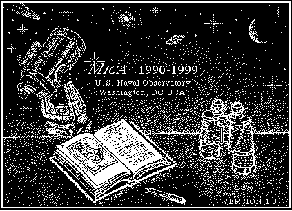
When our dear friend, LeRoy
Doggett, died in April 1996, I wanted to find this
image to put up on the site. Finally I located it.
He was the head of the U.S. Naval Observatory's Nautical
Almanac Office, a "Celestial
Mechanician" by trade, but also a bright, witty
soul-mate to us, who loved great wine, music,
food, astronomy chats, and horrid puns, not
necessarily in that order!
From the time
they discovered the brain tumor to his peaceful,
but tragic death it was but 5 months. And 54 is
way too young, period paragraph. LeRoy wrought
many important changes to keep the Observatory
modern, including the use of Macs, when many PC
snobs thought that GUI was proof of being "a toy".
One very
forward looking project was MICA, for Macintosh
Interactive Almanac (yes, there's also a
Windows version available, and even DOS/MSDOS,
too, or at least there was for many years). I saw
that here was a way to get most of the information
in the Astronomical Almanac (for astronomers) on a
computer screen, but the graphics were rather
plain. So I made this for him, even though
restricted to black or white pixels, only one
"bit" B&W computer imagery (you used random
dot "dither" or halftone patterns to simulate the
grays). It became the program's startup screen,
and the cover of the manual. I'm kinda proud of
that for many reasons, now especially.

And
I also contributed these color icons for MICA, a
few years later, when color (and grayscale)
finally had become available. The original "splash
screen" has remained the original small B&W
image above. I think LeRoy would approve that I
show them now to you.
|
(Top of the Page)
 Back to the Wendy Carlos
Home Page
Back to the Wendy Carlos
Home Page


