 1)
A Significant Discovery 1)
A Significant Discovery
I've
always been fascinated by the way we can see and hear. With
vision the ability to see in colors has a particular charm,
don't you think? At first glance, so to speak, it seems
incredible that we don't just view the world in black and
white, just like the earliest cameras did, the earliest
motion pictures and television. Why not that simpler
reality, than the wonderful sensations of full color that
most of us posess? Could it be there was a much greater
survival factor of those creatures who preceeded us, when
thy had the ability to distinguish colors? Even people
having so-called "colorblindness" still see things in color.
Their views are just more limited in the shades that they
see, usually involving a confusion between red and
green.
Interestingly enough,
most primates which evolved in Africa, Europe and Asia and
environs posses a similar wide range as ours, while those
which evolved later in "The New World" of the Americas
usually have the narrower range of human color deficiency.
(If
some of the ideas below are unclear at first, please stick
with it, as many are better explained later on. For ex.,
this one is covered HERE.)
The technical distinction is between: "trichromats (human
and old-world primates)" and "dichromats (new-world primates
and the common human color deficiencies)." Anyway, I built a
lot of amusing devices way back in grade-school that allowed
me to tinker with mixing various colors, both with paints
(subtractive mixing of: magenta, yellow and cyan
[note:
school kids and dummies usually call them: red yellow and
blue!]) and with
colored lights (additive mixing of: red, green and blue). I
read everything on color I could get my hands on, and with
many years of more or less scientific experimentation, I
thought I knew a bit about the subject. But I was
wrong.
(click
for large view of photo, in a new window)
In the May 1959 issue
of Scientific American an article appeared which challenged
our understanding of the way humans and most mammals see in
color, at least partially. The idea of having rods and cones
in the retinas of our eyes was understood to some extent
back to Raleigh
(that versatile 19th C. scientist),
who postulated the three versions of cones: Red, Green and
Blue. We could see color in brighter light by the interplay
of the different colors around us, as they reflect and are
detected by those three color sensitive cones. While in dim
light the more basic and much more sensitive rods come into
play. These are sensitive to green light mainly, and form
only a monochrome image, although we probably don't much
think about that: seeing in B&W when the light level is
very low.
Edwin Land, the
inventor of Polaroid filters, from whence his company, The
Polaroid Corporation got its name, was well know at the time
more for his "instant photo" cameras, a picture in a minute.
He'd developed the first monochrome Polaroid camera in the
late 40's, after yielding to the impatience of his tiny
daughter's wish: to see some vacation snapshots right away,
not days or weeks later. While the sales of monochrome self
developing cameras and film was good, the real test was to
come up with a way to do it in full color. Land decided to
start at the top, trying to figure out how we saw in color,
what was necessary, and what was not.
In working with three
slide projectors with the classic idea of three images, one
for each RGB "primary" (red - green - blue), taken on
B&W film, then combined in projection using filters of
the same three primaries, a simple accident occurred one
day. Someone knocked off the green filter from the middle
projector. Before it was put back in place, Land and his
assistants noticed that the image on screen still looked
about the same as before. What gives?! Now the green
component was being projected with white light, not limited
to its own color. Surely that should have changed the
coloration a lot. But it did nothing of the sort. Land was
puzzled. Was the traditional view wrong?
He tried fiddling with
the brightness of each projector, but the image stayed about
the same again no matter. Hmm... he turned off the blue
projector entirely. But now what was going on? Once again,
the image continued to display in fairly normal full color!
There he was, staring at a color view, when logic said all
that ought be seen right now was the red from the red
projector, and white from what was the green projector! In
other words, all that ought to have been visible were shades
of white, pink and red, and of course, black. What was
creating the blue, the yellow, the magenta and green tones
that were evident on the screen?
Land removed the two
slides. Sure enough, the screen became a bland pink. They
slides were reinserted -- full color again! The red filter
was removed, so only white light from two B&W slides was
being shown. And, wait for it, the scene reverted to black
and white, so somethings still made sense. What didn't make
such good sense was what happened when the red filter was
again dropped into place -- full color sensations returned.
There's a lot more to it than this capsule story, and it
inspired an whole new theory to describe our color vision
ability, of eyes and brain. Since both retinas of the eye
and cerebral cortex of the brain were involved, Land coined
a new word for the process: Retinex.
It supplements, and in many cases replaces, the previous
understanding, and it represents a true paradigm shift in
our understanding of this extraordinary ability we
embody.
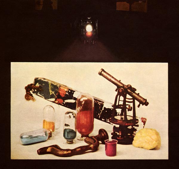
The first widely
available publication of the results of Land's
investigations came out in that issue of Scientific
American. The cover of the magazine featured the view above.
It's a color photo that was taken during one of the
experiments which the article describes. You can see a
double projector at the top, with the upper lens projecting
a white image of one B&W slide, the one below projecting
a red filtered one of a different B&W slide. Both shine
and merge onto the translucent screen we can see through
below. On the screen we can at the results -- a reasonably
full color image, similar to what you would view in that
room. I was mesmerized by the images and article inside this
issue, and would like to share a bit of that awe and mystery
with you on this web page.
|
 (Top
of the Page)
(Top
of the Page)
|
2)
The Two Slides
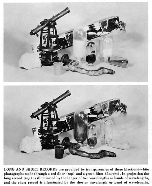
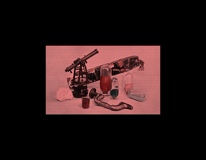
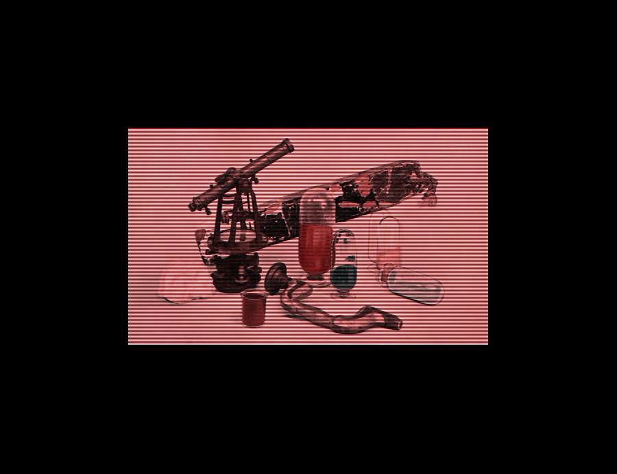
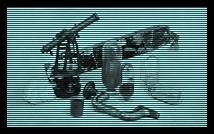
Here
you'll see what those slides are all about. Yes, just two
monochrome images to look at (remember, Land had turned off
the blue projector, leaving just the red and unfiltered
green slides active). Click on it as usual to open a new
window with a large view. Hold it aside or just close it to
return to our text. This is what the camera "saw," not
flipped left-to-right as on the Scientific American cover,
where it's seen THROUGH that translucent screen. The upper
version was taken with a red filter over the lens. It's an
elegant still life arrangement of some old nautical
artifacts, and a few laboratory glass jars and beakers
containing colored powders in several colors. The lower of
the two photos is taken from the same location exactly, same
B&W film, but now a green filter was used over the lens.
If you compare carefully you'll see that some features are
light colored in the upper view, much darker in the lower
view. These objects contain a lot of longer wavelengths, or
orange through red color tones. Other objects are the other
way around, and these contain mostly blue or greenish tones,
which have shorter wavelengths. Those that are nearly the
same in both slides are the monochrome tones, white, gray,
brownish gray and black.
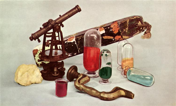
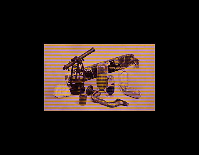
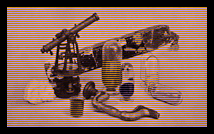
Next here's a good
snappy color version (normal RGB colors in this case) taken
from nearly the same position once again. It's interesting
to compare the two B&W views with this color version, so
you can see exactly what colors give rise to what grayscale
intensity values above. This is all according to what every
theory of color up to Retinex would predict ought happen,
nothing special going on here. (Well, it IS special, but
it's familiar in the sense that we tend to take any such
daily mini-miracle pretty much for granted!)
This image is from a scan I
made and very carefully tweaked to match as closely as
possible the original colors given in the article. I've not
retouched the upper two monochrome photos at all aside from
a few tiny dust specks and printing glitches. You can see
that the backdrop was a simple light gray sheet, the wooden
buoy or float has some orange and green paint undercoat
showing behind worn patches of white and black, the
theodolite telescope is brownish bronze, the sponge to its
left the usual light yellowish tan, the wooden brace in the
center shows ordinary wood tones, and there are glass
containers with wine colored powder, deep red, jade green,
yellow ochre, and a light blue-gray tone. Notice how they
are positioned more or less "naturally," with the colors
spread essentially at random in the view. That's important,
believe it or no.
|
(Top
of the Page)
|
3)
Let's Duplicate the Experiment
If
you will now click on this multi image you'll see how we can
come close to duplicating what Land described in the
article. Up at the top of the bigger view you'll see two
small versions of the original two B&W slides,
side-by-side. Since we have no way to telnet a pair of
projectors to you (now THAT would be some download, even for
T1 speeds! ;^), we'll resort to the same trick color
television has used for years: we'll pass the pictures
through a grid of alternating lines, one in each primary
color. The monitor you are now looking at this page with
probably uses the same system, although the grid for most
decent computer monitors is very fine, very subtle, the
stripes or segments or even dots lying closely together.
There are three different colored strips or dots: red, blue
and green, on your monitor screen. Grab a magnifying glass
and take a look, see what yours uses, lines or dots or
something else.
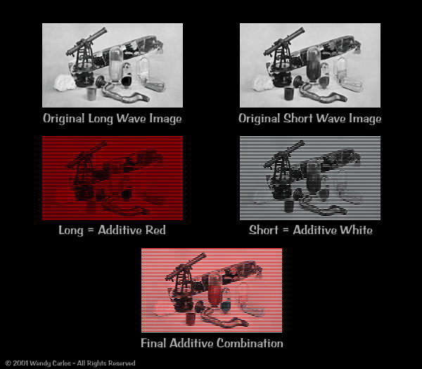
In this case we're
going to duplicate the Land experiment of two colors: white
and red. So I've sliced the original red image up into the
narrowest strips we can view in a browser, 72 dpi. The image
follows a grid of 36 horizontal strips per inch, alternating
black or image slice, from top to bottom. The image slices
then are colored red. The other image from the green version
remains in white tones on screen, sliced again into 36
horizontal strips, same spacing, black or image slice. But
the black strips are located where the first image has its
red image features, and the visible image slices are located
where the red toned image has its black stripes, like
shuffling two halves of a deck of cards together.
The second side-by-side
pair of images shows what happens before combining the two.
One effect of black strips is that the brightness is
somewhat dimmed, but that's what any "additive" color system
does: limit each element to a narrow region of one color.
Filters will remove some overall light from each color,
leaving only the hues you want. And when you restrict each
color only a portion of the total available screen area
(one-third, or one-half), down goes the brightness. Anyway,
that's why the second pair looks dimmer. Yes, the grid is
too visible at this small size. But let's go ahead drag
copies of each and carefully overlap them so each adds
whatever brightness it has to the other, alternating along
the grid. Do you see the colors yet?
Well, these are tiny
versions. Let's go through the same steps at a more
reasonable size. Since I don't know what size your monitors
all are, I've prepared two versions, one medium sized, the
other larger. These are both below. The views are surrounded
by flat black, so you can block some of the other lights and
colors coming from your screen. To do it correctly, step
back a little from your screen, and perhaps grab a small
tube like the kind toilet tissue comes on. Cut one of those
into two shorter lengths, and hold them rather like
binoculars in front of your eyes, to block every bit of
light except from the image. This will be a very decent
duplication of what Land and his collaborators saw back in
the late-50's. You might also try to squint slightly with
all of the images shown here, so your eyes will average the
colors together more than if seen sharply, and let Retinex
do its best. Pretty neat to see so many colors where only
red and white are actually present, isn't it? Go ahead, take
a look for yourself!
|
|
Click
the image above for smaller monitors
(12-16")
|
Click
the image above for larger monitors
(17-21+")
|
By the way, since images
represented on standard RGB monitors are more limited than
what our eyes would perceive in similar situations, I can't
show you most of the variations of Retinex two-color viewing
here. I did find another variation pair, yellow and blue,
that works reasonably well, although not as good as the
standard red - white pair above. You can compare the next
small image and its larger size with those just above. Here
we have used a similar grid to produce the accurate additive
coloration, much as we did before. But now the red and green
phosphors are being blended together to produce a yellow
image. The source is the "long wavelength" B&W component
that has been shown in red up until now. The "medium wave
component," or green view, shown in white previously, is now
sent to the blue phosphors only. This idea of making yellow
be the "reddest" shade works quite well, as we still see
reds and oranges. The blue tones are fine, but dark greens
don't jump out quite so accurately, and the yellows are also
subdued compared with the red - white versions. As before,
the overall cast, in this case a purple tone rather than
pink, would vanish if the images were projected in a dark
room with yellow and blue lights, at least to our eyes. It's
worth clicking on this one, too, for comparison's
sake.
(Note: only a medium size image is available here,
use it for all monitors and you'll get the general
idea.)
|
|
Click
the image above for any monitor
|
Notice that this color
pair, yellow-blue, will be featured
on a later page, on
a completely different topic, that of "colorblindness." Then
we'll try to collide the two ideas together in some rather
surprising ways, with images to demonstrate what's going on.
I can promise that there are a few smiles in store, and the
more one knows about it, the more magical the whole thing
becomes!
|
(Top
of the Page)
|
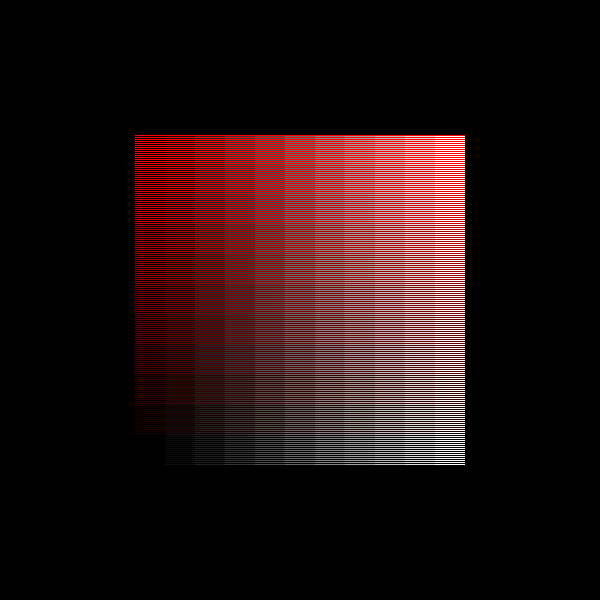
4)
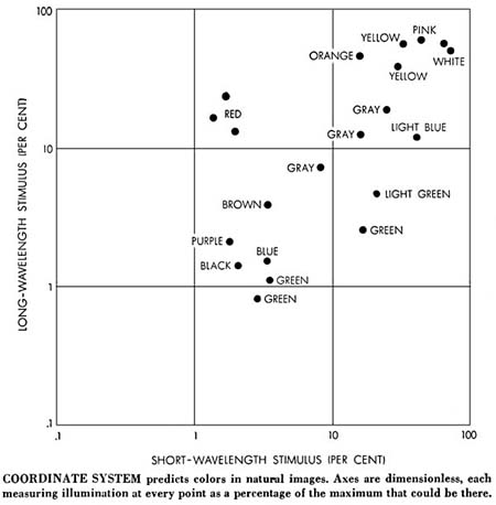
A Bit of Analysis
Land
and his team tried to make sense of what was happening
before their astonished eyes. One thing they did right away
was to measure the brightness levels of various places on
those two transparencies. The calculated the density of
chosen points by measuring the monochrome slides, compared
these as we might have done above, with the colors the eye
saw at those places, and plotted some of the results on
charts like the one above. Click it to see a nice larger
version as usual. Notice that the "scales" on the side are
not in any definite units of measurement. Instead everything
is in purely relative terms, pretty much as our eyes seem to
do it. There's a relative "maximum brightness," and a
relative "minimum brightness"; there's one of them for the
redder long wavelengths, and one for the shorter
wavelengths, too.
In this chart the upper
right is the lightest region, the lower left is the darkest.
The longer wave image is measured vertically, the shorter
wave image horizontally. If both of the values change
exactly together, the picture elements will lie along a
diagonal line going from lower left to upper right. And when
you check it out here, that's where you find the locations
that look gray, black and white. A dot placed above such a
diagonal tends to have longer waves, or be "redder," when
placed to the right it tends to have shorter waves, or be
bluer. Green tends to be found further to the lower right
than bluer tones, which tend to lie just below the neutral
gray diagonal.
This chart was probably
taken from the same still life we've been looking at, and
you can see nicely here where the brightness tones that
we've been talking about are found, which are the more or
less important ones for a given sensation of color. The
crucial thing is that these were taken from a naturally
occurring random disposition of objects. You couldn't just
insert a step wedge of values as the chart might suggest,
going from black in the lower left corner, red at the top
left, pink at the top right, and white at the lower right.
Such a step wedge pair of slides would produce only those
pinkish tones and nothing more! It's a real world image that
lets the magic work. Just click the image below to see a
real additive example, made exactly like those still life
examples above, using red + white light. The only difference
is the missing "real world" slides (I kid thee not). And
wotta
difference!
So we experiment with more
chaotically colored images, as you might take with a camera
or draw yourself in any medium you're good at. The more
"hodgepodge" there is, the better, as far as the eye is
concerned. Perhaps those faded videotapes we watch look
better and more vivid when we step back if there's a complex
sequence of moving images on the screen, rather than a
minimal and static arrangement. The eye has evolved its
sense of color because it gives us some kind of survival
benefits, and clearly what emulates real life in complexity
of details and motion are where the eye works best, and gets
all of the information it can from even limited stimuli.
"Duck, there's an orange boomerang headed right at you, from
between those two trees ahead!"
There's one final
element that we've not yet touched on. These examples,
except the one in yellow and blue, have been presented using
red and white light, because that combination works well and
is easy to reproduce. It's also historically what Land saw
that got him started on this detour which only gradually led
to the practical goal: color Polaroid "instant" photos. That
invention arrived, I remember, with the SX-70 camera in
1971. I marveled at the breakthrough, while at the same time
didn't much care for the extreme contrast. The color
Polaroid film uses the conventional three colors, RGB. But
we now know that quite a lot of information can be gleaned
from just two. For Retinex almost any color pair will
work..
Two yellow lights with
very narrow, close together spectrums will do the trick.
Yellow works well for either the long or short stimulus. It
becomes the redder one when paired with green, or the bluer
one, when paired with red, isn't that a surprise, now. To
the eye full color images still come through plain and
clear, but we can't take color snapshots directly that show
the same effect. Once the originating spectral colors are
unavailable, as with color video and computer monitors, the
options become limited. The eye is just "smarter" than any
camera. You realize that right away after you view and
photograph objects under tungsten light, or at sunset, or
with fluorescent lamps, compared to clear daylight. Your eye
sees the same colors for the objects view all the time. A
digital CCD or color emulsion does not, and must either be
filtered to correct for the light, or adjusted later when
printed or duplicated. Our natural Retinex perceptions are
even cleverer, an certainly more sophisticated than we ever
suspected before!
|
(Top
of the Page)
 Back to the Wendy Carlos Home Page