9)
Investigating Color Deficiency 9)
Investigating Color Deficiency
This
atmospheric shot is of some the improvised equipment I've
used in an attempt to investigate the color world of those
who have the most common, red-green form, of color
deficiency. It started with your usual human empathy and
curiosity: "you mean everything you see is just black and
white? Like your doggie?" So many bits of misinformation out
there, and here we all are on the net and web, one of the
richest sources of misinformation yet conceived! Okay, sure,
take everything I'm presenting to you here with a pinch of
doubt, too. And try it out on your own. That's the most
important part of modern knowledge and whatever bits of
"certainty" we can find on this planet: "does it work when I
duplicate the thing for myself?" I'm attempting to give you
all the essentials to work it out independently, so you can
draw your own conclusions. But first read about some of the
experiments, and what I've learned from them, including my
best guesses about what's actually going
on.
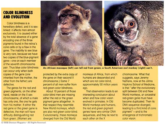
We have gradually learned
the causes of "color blindness" in humans and primates
(BTW-
many mammals see much like we do, three colors, cats have
more "rods," so their color world is perhaps less intense,
but not like black and white movies, either! Others see in
two colors, again not strictly
monochrome). Most of
the time one set of cones in the eye, red, green or blue,
has the wrong pigment to absorb light of the normal
wavelength or color, to register the proper signals to the
brain. It may be a slight shift in the pigment, almost
always in the wrong direction, so one's color range is
narrowed. Or it may be that it is identical with the pigment
for other cones, so that both sets produce identical
responses, losing discrimination over that region. Since our
irises, skin and hair color differ, is this surprising?
(You
can see the actual retinal pigment colors at the top of the
next chart: yellow, red-magenta, purple and bluish-violet --
mix them together, a reddish shade results, and that's what
bounces back a photo flash, when you obtain "redeye"
snapshots!) It's
sex-linked, so more men than women have it, and it comes in
a few varieties. The most common forms are caused by
compromised red or green retinal pigments, one or the other,
usually not both. There are also very rare cases of the blue
pigment being affected. (Click the picture of the monkey or
CLICK
HERE, to read a
bit more about this fascinating topic.)
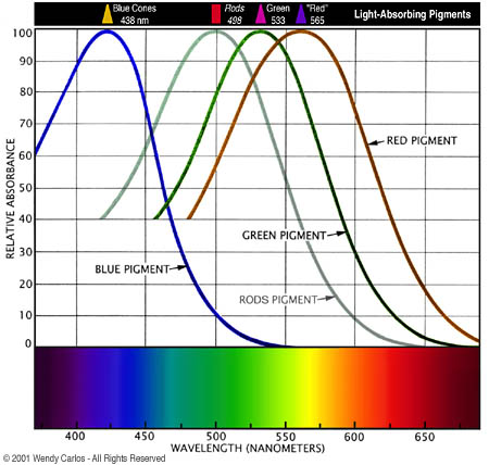
Historically mammals had
just two color pigments, for blue and green cones. The
primates of the New World are still at that earlier stage of
retinal development (this is better described in the
previous link, CLICK
HERE). So they
are like humans who have a missing red pigment (-red
dichromats), the most common kind. The word, dichromats,
means "two colors." Most of us are trichromats, with three
colors of retinal cones. At some point our chain of mammals
mutated again in our favor. The green pigment split into two
kinds, one redder than the other (again note samples of the
actual cone and rod pigment colors near the top -- each is
the "complement" to what color it absorbs, pretty neat). I
was surprised to learn how close the two actually are, that
what we call "red" is more of a yellow, but it's as red as
we get. The "red" does the job, even though it overlaps the
green pigment pretty closely, as you can see in this plot
for the normal eye.
(That's why in the plot I colored the red curve more of a
yellow-orange.) The
small red-green pigment
difference
(purple vs. blue-violet) is
controlled by very little DNA, which is why it's so much at
risk. Our eye's blue pigment is represented more redundantly
by its DNA, and is much less likely to be shifted. The rods
(dim light, monochrome vision) measure similar to the green
curve, moved a little to the left and with a slightly
broader curve.
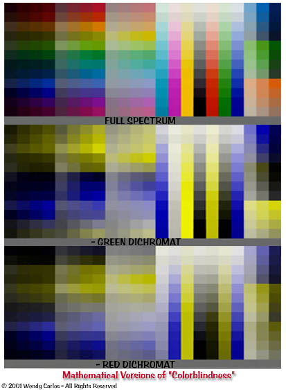
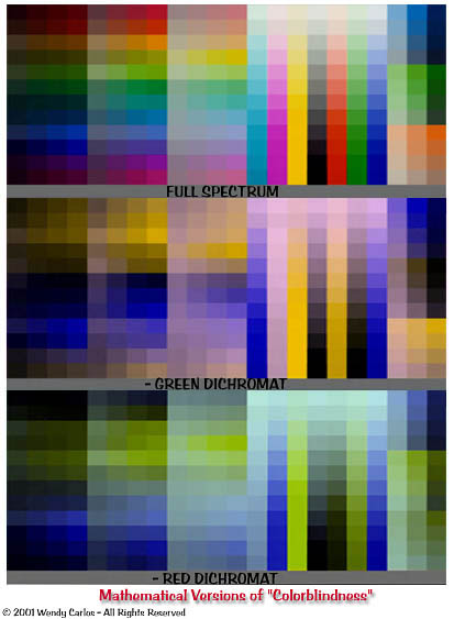
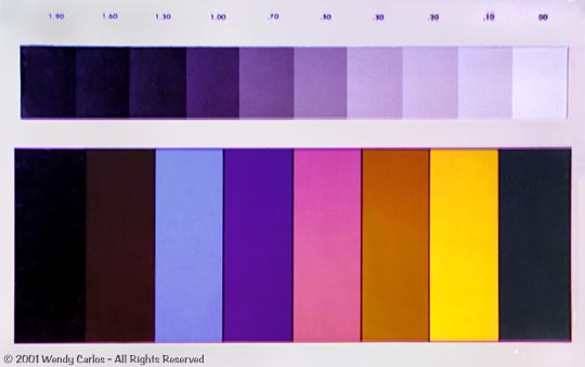
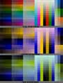
Okay, that's enough
background to understand the next two images. These show the
very complete color chart we reproduced for you on the last
page, to print for testing the Retinex viewer. You'll see in
the views below (again
click each) that three
charts are stacked for each image. The top chart is the
reference: white light and normal vision. Below that it is
the theorecital representation of an inactive green pigment,
or -green. So this dichromatic eye would see with just the
blue and red cones. Green would appear darker than a normal
eye sees, red would be unaffected. The bottom chart is the
opposite case, -red. Here the red cones are inactive, so red
objects are darkened, green are unaffected.
|
|
Three
Color Charts,
theoretical dichromats
|
Three
Color Charts,
with adjustments
|
The systematic arrangement
of these charts is useful here, as it "fights" Land's
Retinex processes (it's just too damn regular, not mixed up
randomly, so those extra color perceptions don't kick in
very much). It's a pretty tough test to reproduce well. What
I've done on the left is to remove the green layer for the
-green images, and pasted a copy of the red to that channel
instead, which forms yellow. And for the -red below, the red
is removed and replaced by green, again forming yellow. This
seemed a simplistic way to go, and so the alternate version
on the right was made. It's the same three charts again, but
this time the missing channel is also darkened slightly. So
-red has dimmer red, -green has dimmer green. It's difficult
to judge what matches dichromatic vision best. And we can do
a LOT better than fooling around with this sort of
mathematical representation. But it's a pure way to begin,
and you can study the charts yourself later, to see how each
color in isolation would be affected in its brightness and
hue to a "colorblind eye."
(For the sake of
completness, HERE
is a set of four typical standard
Dvorine-type "color
blindness charts", which you've probably seen before, and
are most often used by doctors, schools and employers to
test for the presence of many variations of color
defficiency.)
|
 (Top
of the Page)
(Top
of the Page)
|
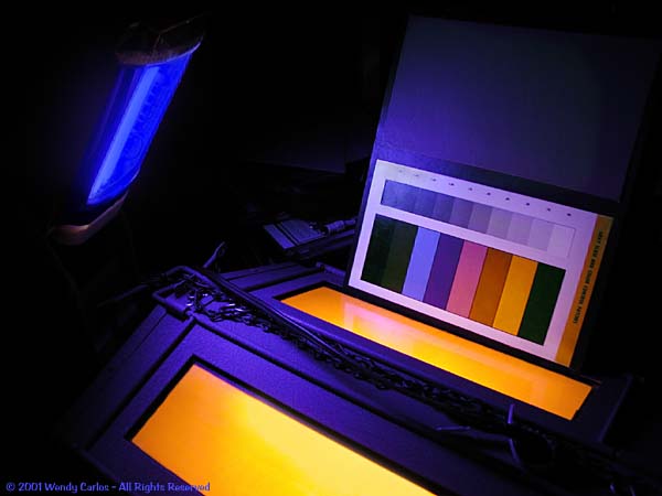
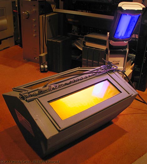
10)
Another "Viewer" Experiment
Which
brings us to the equipment you see here. In the foreground
is something that's not seen too often these days. It's a
special photo darkroom safelight. The light source is a
low-pressure sodium filled gas tube, not unlike mercury
vapor. It takes some time to warm up to operating
temperature. First the light glows dim and pinkish. After a
few minutes full yellow brightness is reached. You may see
them used as highway or rural lighting fixtures along the
road, as some studies that indicate they provide excellent
night vision for driving. They're also very "night safe" for
astronomy, and cause very little light pollution, especially
compared to the awful bright peach tone of "high pressure
sodium vapor lamps." Gee, I hate those harsh lights! But
more people seem to dislike the simpler yellow version
(perverse
non-astronomers...).
In a color darkroom
it's very hard to find any light that we can see but the
photo emulsions can't, except weakly. This yellow fits the
bill, as its an intense very narrow light source, with a
spectrum essentially of just two bright spectral lines
nearly touching each other at 589 nanometers. Through a
spectroscope you see the one spike, the rest is black. So
everything we see with such a light source as the only one
will appear to be monochrome. Why? Well, there is only the
one wavelength that gets any energy. There's no blue
whatsoever, and the red and green cones pick up the 589 nm.
the same way, so there's no visible difference for red and
green objects. These appear to be gray. Hmm... that's
something interesting: a light in which we confuse red and
green... could that
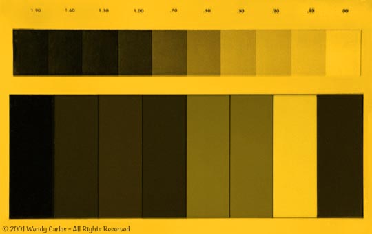
property prove useful someday? Anyway, here's a standard
minimal color chart, as seen with sodium light (taken with a
normal color digital camera):
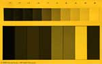
|
Photo
Color Chart
under sodium light only
|
Of
course it doesn't look quite this way to our eyes. We don't
notice the pure yellowness if there's nothing else to
compare it to, and so it seems "whiter," more monochrome. To
see what that Kodak chart really looks like, check the image
to the left below, seen in white light, same digital color
camera. (Since
your clicks open new windows each time, you might want to
hold a new image window open in your browser, then return to
the text window to open another image, so you can compare
them simultaneously on screen, given a large enough
monitor.) The trick of
low-pressure sodium merging red and green vision never
completely left me. I grew up in a town which had sodium
lamps in several areas as street lights, and I used to bring
color photos and comic books with me when my family would go
for a night drive, to study the way "everything turned to
black and white" (well, yellow) when that odd light came
into the car onto those images. My parents tolerated such
quirks, thank goodness. Years later I was musing about color
deficiency with a good friend, who was a -red dichromat, and
the images from those street lights, later my darkroom
safelight, jolted my memories. I wonder if the loud click of
recognition was audible?
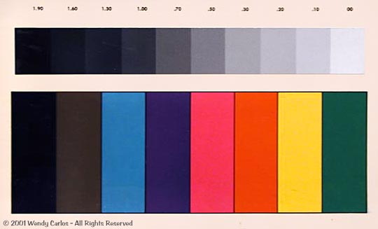
So -- if you view
objects under sodium light only, you lose the distinctions
of red and green cones, right? But you'd be missing out on
blue, and Steve could easily tell what was blue, or violet
or mauve, and so forth, he explained. Okay, then what we
really need is to add a second light which is a pure deep
blue. That plus the sodium light, and you should see
approximately what my friend saw! Yes, it's true. To the
right below is an example of the results. I'm surprised my
digital color camera could pick it up this well. This is the
same color chart, but sitting in front of those two lights,
just like the photo up at the top of this page. I've color
corrected the balance, as a camera is not as "smart" as our
eyes, and insisted on reproducing a mild purple cast
overall. Fixing that doesn't add any information (even so, I
left some of the purple cast in). This is what my "eureka"
moment turned up, when it simulates the color world of a
red-green "colorblind" person:
|

|
Photo
Color Chart under
white light, normal color
vision
|
Photo
Color Chart under
sodium and deep blue lights
|
I
find this rather astonishing, don't you? This is certainly
NOT the dull, monochrome world the books usually tell us
about. Those shades, while not fully normal in range and
hue, are still very colorful, indeed. I note that the deep
green swatch on Kodak's color chart is dark enough that here
it comes out nearly black. But red is only slightly
darkened. So this would be what a -green dichromatic person
would perceive, fairly closely. To simulate -red vision we'd
need to move the sodium light to a shorter wavelength...
(right, sure; is there a simple, not too costly source for
monochromatic yellow green light?)
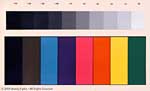
We still seem to be
getting somewhere here. Next is the same fancy, regular
color chart we've seen before, like those theoretical
representations above. Remember, with so much regularity you
lose most of the Retinex effect, so this is a difficult
chart to reproduce, worse than the simpler Kodak chart.
There are two views, one under while light to the left, and
the other under our special yellow plus blue lights to the
right.
|

|
Fullstep
Color Chart under
white light, normal color
vision
|
Fullstep
Color Chart under
sodium and deep blue lights
|
No
doubt about it, this is more disappointing than the first
color chart. The red tones seem darkened as well as the
green. It probably also depends on what dyes or pigments are
used in the printing. Oh, well, you'd have to shift the
sodium lamp wavelength to the right slightly to tweak that
-- out of the question for at-home experimenters. What we
get with sodium light is not quite a -green simulation, yet
not quite -red, either, but something in between, a merging
of the properties. Cut to the chase: two red-green deficient
friends observed with these lights, here in the darkened
studio, when the experiment was still new. And they said
that everything looked close to the colors they usually see,
but that certain hues were made slightly lighter, some
slightly darker. But the effect was very close, if not
exactly the same to their dichromatic vision.
Of course that has to
be the case. We're using very sharp spikes of color here,
not the usual smooth spreads of spectrum given off by
incandescent lights, by daylight, or even the better
fluorescent lights. Some pigments and dyes on fabrics and
printing inks will reflect a wide enough color band that the
differences are averaged out. But it's not the case with
every color example. A concern of professional color
technicians is something called color metamerism.
Many samples just look different when seen under
fluorescent, incandescent, daylight (direct sun) or
cloudy-bright conditions. They change slightly, but visibly.
And these metameric shifts are what my friends were able to
detect (they're very bright, precise people). My two lights
didn't provide "normal" lighting conditions, causing small
changes of lightness and darkness. Otherwise, the effect is
close, and for some objects it's nearly an exact match. Oh,
well, it's better than I expected, and I am frankly still
smiling over this one. I hope you can find a way to try it
for yourself, although these images should get you
going.
It's been a while since
I lugged out the lights again this week, to take these
digital photos to show you. I ought mention that the source
for the blue light is no longer the old slide projector I
used to use. That had a very narrow projector's beam that
was too bright in one spot, too dim elsewhere. And it got
quite hot for color filters. This time I have one of those
wonderful Ott-Lights, something recent which is just dandy
for home construction projects, equipment repairs and
tweaks. Great for older eyes, too -- I love these small,
bright, near daylight spectrum work lamps
(thanx
for the tip, Carol!).
It also runs very cool. With a spectroscope I can see it has
many good lines and wide color regions, much better than
most fluorescent lights. There's also a dandy deep blue
line. I isolated that one by taping two layers of deep blue
acetate color filter over the lamp, followed by a large
Wratten #47 color gel, which is an even deeper blue. It
doesn't photograph above anywhere near as rich a blue as it
is to the eye. The effect is a very reasonably pure source
of diffuse blue light, which blends well with the color
safelight's sodium yellow line (forgot to say, it's a Thomas
Duplex "Super Safelight"). So that's what you see in the
equipment shots above!
|
(Top
of the Page)
|
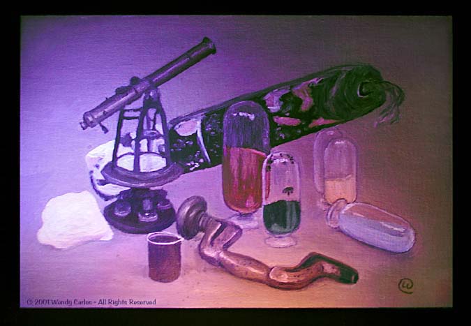
11)
Retinex "Red-White" for Dichromats
Now
it's only logical to put together these two ideas we've been
looking at: Land's
Retinex, and these
novel "colorblind" simulations. It so happens there's an
idea test subject -- that student oil painting I made back
in college. So let's fetch it and put it down in front of
both the sodium and deep blue light sources. You can see a
digital photo here taken in an otherwise dark room. It's the
same setup used on the yellow-blue images of color charts
above. But the painting is too large to illuminate evenly
with those lights, at least for the camera. Let's save it
anyway. We get this stylized dramatic two-toned spotlight
effect. You can tell the blue light came from the leftside
above, the yellow from below, "a roaring fire under the
moonlight !"
As we examine the
larger version, notice that Retinex comes to the rescue for
most "color blindness." One can plainly detect sensations of
red, purple, yellow, orange and blue from the original that
by now has become familiar to us. The green color is not so
good, but that's the fault of my painting, slightly too much
black. It's the one painted mixture error that's difficult
to illuminate properly under any lighting. Evenso,
isn't
this something?! We
have clear evidence here about how two processes conspire to
cancel out each other's weaknesses, and "let the light come
shining through!" What we see above is definitely a
color
image, is it not? And it has an even wider spectral pallet
than those old two-color early Technicolor (and Cinecolor,
Truecolor, Royal Color, etcetera) films.
Yet all we're really
looking at is an oil-painting made using just
three
tubes of pigment: red, white and black, lighted by one
yellow only sodium light and one deep blue filtered
fluorescent lamp, simulating a -green dichromat's limited
color world rather closely. But, but, but... yes, it would
appear that we have to adjust our thinking here. The
"classic" RGB theory of color vision could
not have been the whole story.
I don't know about you, but this finding gave me great
delight, that those who have color "blindness" are not
really so "blind" to colors after all. You have to hand it
to the redundancies of evolution that we have more than one
way to perceive the sensations of light and color, and where
one may not work so well, another is there to take over.
Pretty kewl, no?
One
more digression before we get off the topic of color
deficiencies. Clearly those of us with normal color vision
can't ever be quite sure of exactly what a dichromatic
person sees. From all we've learned, though, it's clear that
we have evolved, and also as individuals have developed,
many checks and balances, so important to our survival must
be an ability to see in color (don't eat the green or yellow
berries, just the red or blue ones... ;^). I wouldn't be at
all surprised if everyone learns while growing up how to
interpret color sensations, along with all those other
necessary stimulus-parsing skills needed to grasp the world
around us. We compensate for what is not fully present, and
adapt to the abilities we do posses.
Only under certain
conditions will someone notice or comment on our
differences. Do we really know if everyone else "sees" the
same blue sky, the same "green" grass, the same "red" fire
engine? In the way we're discussing, no, we don't exactly.
But in the last decade or so the actual retinal pigments
from many human eyes has been measured. We can now say that
most normal eyes contain the very same 3 + 1 pigments. So we
should respond to identical colors in identical fashion with
our eyes, even if our brains interpret them in slightly
personal ways. And we can categorize those who have
compromised retinal pigments, calculate the effects and the
ambiguities. Where there's an important signal or warning
color that must be perceived by everyone, like a traffic
light, we try to standardize on other clues, like the
relative location (yes, the red one's on top). Even the
original old two-light traffic signals in NYC still had the
red above the green.
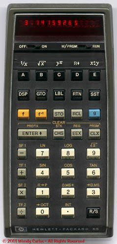
At other times good old
serendipity plays a role. Or perhaps I'm not giving credit
where credit is due. In any event, I'll leave you with the
photo here of my venerable "ancient" Hewlett-Packard HP-65
pocket calculator
(click on it for a lifesized view).
It was given to me by a generous friend for Xmas of 1974,
and I've treasured it long before it became a collectable
(it still works!). This was the first handheld "computer"
produced. Had a similar power and speed to the original
Eniac "electronic brain" from the late 40's. You'd write
short programs, test them, and save them on little magnetic
strips. Long story for another time. Why bring this up? Well
look at the keys! The colors used are ivory, light gray and
black, and for the ever important "function keys"
yellow-gold and blue. Those are the best possible color
choices for the huge majority of color deficient people,
lying right along the blue-yellow color axis we've been
investigating up above.
Long before "political
correctness" and and "disabled-friendly" were even concepts,
here was a small device that did not penalize those with
incomplete color vision
(note: most LED's were red back then).
I noticed it the first time I saw one and grinned like a
Cheshire. Perhaps I'm just goofy (don't answer that). But
it's a relief to have a web page to pass on this
observation. For important controls on computers and other
equipment, please, please:
|
Choose
colors along the yellow-blue axis if you want
certain buttons and knobs to be instantly
recognizable by most of us!
|
(Yellow
- Gold - Ochre - Tan - Sienna - Brown - Ivory -
White - Black - Gray - BlueGray - Sky Blue -
Medium Blue - Cerulean - Cobalt -
Indigo...)
|
Of course the "yellow" can
be somewhat more orange or lime, the blue more aqua or light
violet, with minimal compromise. And perhaps our colorful
web pages, including this one, ought be considered in light
of this concern. At least we should make the lightness
different when using confusable pairs (I've tried to do that
with the red-green link colors here). Okay, enough
"walla-walla" on this fer sure. Time for something else much
less serious, don't you think...?
|
(Top
of the Page)
|
12)
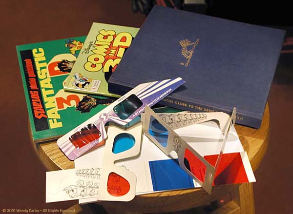
3-D Shadowgraphs
I'll
just bet most of you have seen 3-D books, photographs,
magazines and comics like the motley assortment shown here.
These are technically called "two-color anaglyphs," and
usually are printed in a red colored ink and a greenish blue
one (cyan). It's very common to receive a pair of similar
red-cyan spectacles of some kind with the publication, the
red usually for the left eye, the cyan one for the right.
They are usually inexpensive cardboard affairs, either to
hand hold before you eyes, or with ear pieces to wear like
normal glasses, with or without any corrective spectacles.
This shot shows only a few I could put my hands on
quickly.
During the yearlong mid
century love affair with 3-D movies in 1953-54, many such
printed examples appeared. Several new series of 3-D Comics
and adventures were launched, which printed drawings
cleverly retraced into two copies, some objects shifted
according to a chart by a few millimeters left or right,
others by different amounts, such that the viewer would see
something that matched our spectroscopic vision's
expectations. As a kid I remember finding such comics, and
also seeing several motion pictures in 3-D. Perhaps some of
you did, too. Usually the films were projected with the much
better way of keeping the left-right image pair sorted out:
"Polaroid" filters and glasses (that
didn't work with printing, polaroid printing is esoteric and
costly, so the older red-green idea was used
instead). Yes, Edwin
Land's first big invention, polarizing "J-sheet," arrived
just in time to provide Hollywood an easy, cheap way to give
viewers now attracted to the Tee-Vee an incentive to return
to the empty movie-houses: motion pictures that leapt from
the screen: Three-Dimensional Movies!
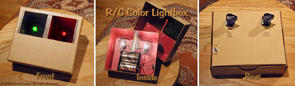
Funny that Land's name
should come up so logically here. A page back we
investigated a simple viewer box that anyone handy could
assemble at home to explore these Retinex vision abilities
we're blessed with at birth or soon afterwards. You'll
remember that box had red and green filtered lights, like
this:
Well,
that box gives me a very distinct impression of
Yogi-Berra's: "deja vu, all over again." Reason being that
when the first 3-D craze came around that I remember (there
were still others earlier), I had come up with a silly,
useless "kid's invention." I thought it was original, but
others have come up with similar ideas since then. This
consisted a pair of flashlight bulbs placed into a small
cardboard box, with some batteries. There was a slot in the
front -- to slip a pair of cheap cardboard 3-D glasses into
-- one filter positioned behind each 1" round hole that I'd
cut to let the light shine out. It wasn't very different
from the viewer box you see here (bet you didn't see this
connection coming), although smaller and not so well made,
and without any brightness controls. Anyway relax, this
final suggestion isn't another "science at home experiment"
-- it's
time to play!
The idea was that you
could place this on a stool in front of a wall in a darkened
room. The beams would shine on the wall, overlapped. If you
put your hand in front of it, holding a pencil or some
scissors, or an outstretched finger, and moved it at the
small light box, you would see reddish and blue-green
shadows cast on the wall that followed your pantomime. If
you put on a matching pair of 3-D glasses to the ones
inserted in the front of the box, something truly wonderful
happened (well I thought so at the time -- it seemed like
magic!). The shadows lifted off the wall and floated in
front of you, with an amazingly realistic solidity and
depth! I don't have very good depth perception myself, as my
eyes were slightly crossed at birth, but even I could tell
that this really worked! (Note:
Andre de Toth, the director of the finest 3-D movie, "House
of Wax," was blind in one eye. True
story.) I invited my
friends and family to see childish "puppet shows" and mini
melodramas with hand puppets and props I'd gathered
together. They'd sit beside the box slightly to the front,
so they couldn't see easily what I was doing, and watch the
pedestrian "mella-dramma" come off the wall and into their
faces. It looked something like this:
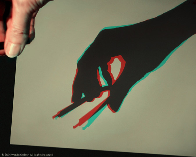
This
digital snapshot (don't
forget to click it for new window with large
view) shows my hand up
to the left casting some two color 3-D
Shadowgraphs
(that's what I've always called them, anyway) on the white
poster board propped up behind it (the light box is off
screen to the far left). I'm holding a tool for removing
computer chips from sockets here, no particular reason, it
happened to be handy. If you look through 3-D "anaglyph"
glasses like those with the books above, you can make out in
this informal photo a little of the effect. But it's so much
better in reality, and especially in motion (shadows don't
have a lot of details). Often I placed the box on a bed,
just above a pillow, shining straight up. Then I invited my
vict.. I mean audience
member
(vidience member?) to
lie down and look up at the ceiling through the glasses. Say
what? Go ahead, you won't believe this... So much dropped on
their faces from above no one lasted more than a few
minutes, but, hey, it was a lotta fun!
If you want to try this
yourselves (and I do recommend it, can't you tell...? ;^),
you can use the same box from the previous viewer. Note how
the green filter is over the right hand light source, red
over the left, and they're separated not far from the
spacing of our eyes? I was looking ahead (back?) to this
stunt. You should make a modification, though. Carefully
remove those two special deep filters, they don't let much
light through. Get a regular medium red photo filter, and a
greenish blue one from the same camera store. These can be
nearly any reasonably pure tone, somewhere in the Wratten
mid 20's for red, and the mid 60's for the cyan. Or take
apart some anaglyph 3-D glasses and use the color cellophane
(block out any light that may leak around them if they're
too small).
If you'd prefer to use
Polaroid filters instead, as they're less fatiguing on the
eyes, sure, you can do that. It bugged me for a few months
why polaroids didn't at first seem to work at all with my
adolescent invention. I thought I had gotten some "inferior"
polaroids from the 3-D movies. Nope. It's the
screen.
You need one that doesn't diffuse and "depolarize" the
light. Same as most movie theaters use, I later discovered.
Aluminum paint on wood or fiberboard will work dandy. So
will metallic poster board sheets that good art supply
stores carry, the "silvery" kind. Some slide / movie
projection screens (metallized lenticular) are excellent. I
guess one could repaint a room with aluminum (ha-ha), but
that was as far as home rules let me go with that idea. In a
small space (like a closet) I used the polaroids with a
metallic screen, otherwise stuck with with the red/cyan
version on walls and ceiling. Still do. Whichever way you
go, it's surprising fun, that much I promise!
--Wendy Carlos
|
(Top
of the Page)
 Back to the Wendy Carlos Home Page